
About The Project
The goal of this project was to find a website with poor navigation. Navigation is essential for any viewer to be able to explore through a given website and find the information they're looking for. After finding a website to complete the project on, research, testing, and brainstorming took place to obtain as much data and information as possible to help improve the website as a whole. The final project should be an analysis of the process, data results from testing, and include solutions to help improve the navigation.
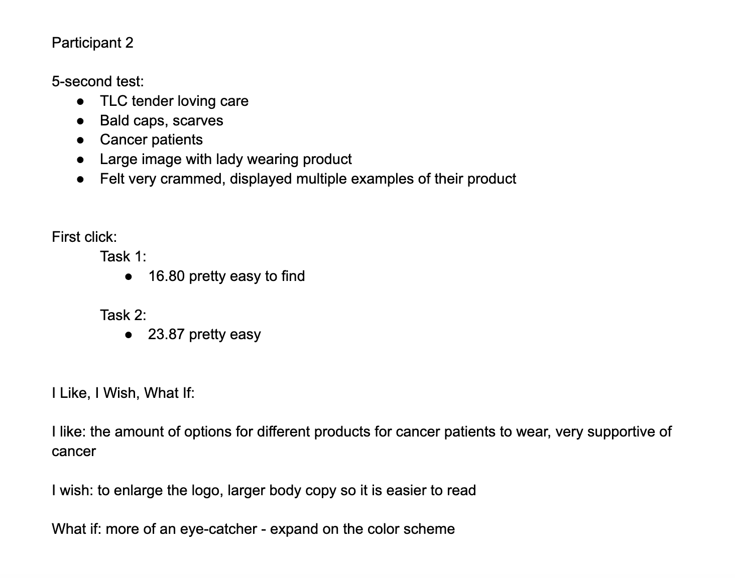
Testing
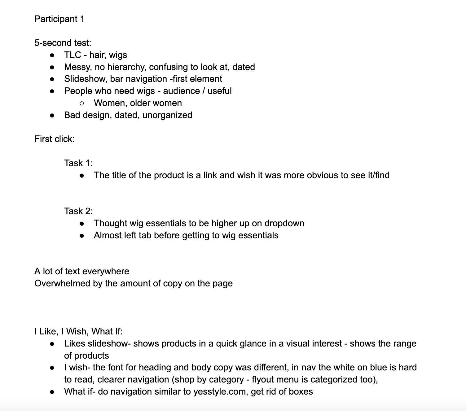
Below shows the results gathered from two participants on three different tests: the 5-Second test, the First click test, and the I Like, I Wish, What If test. These tests helped to better showcase the pros and cons of TLC's navigation and allowed them to complete a task and share their thoughts and opinions on the website.
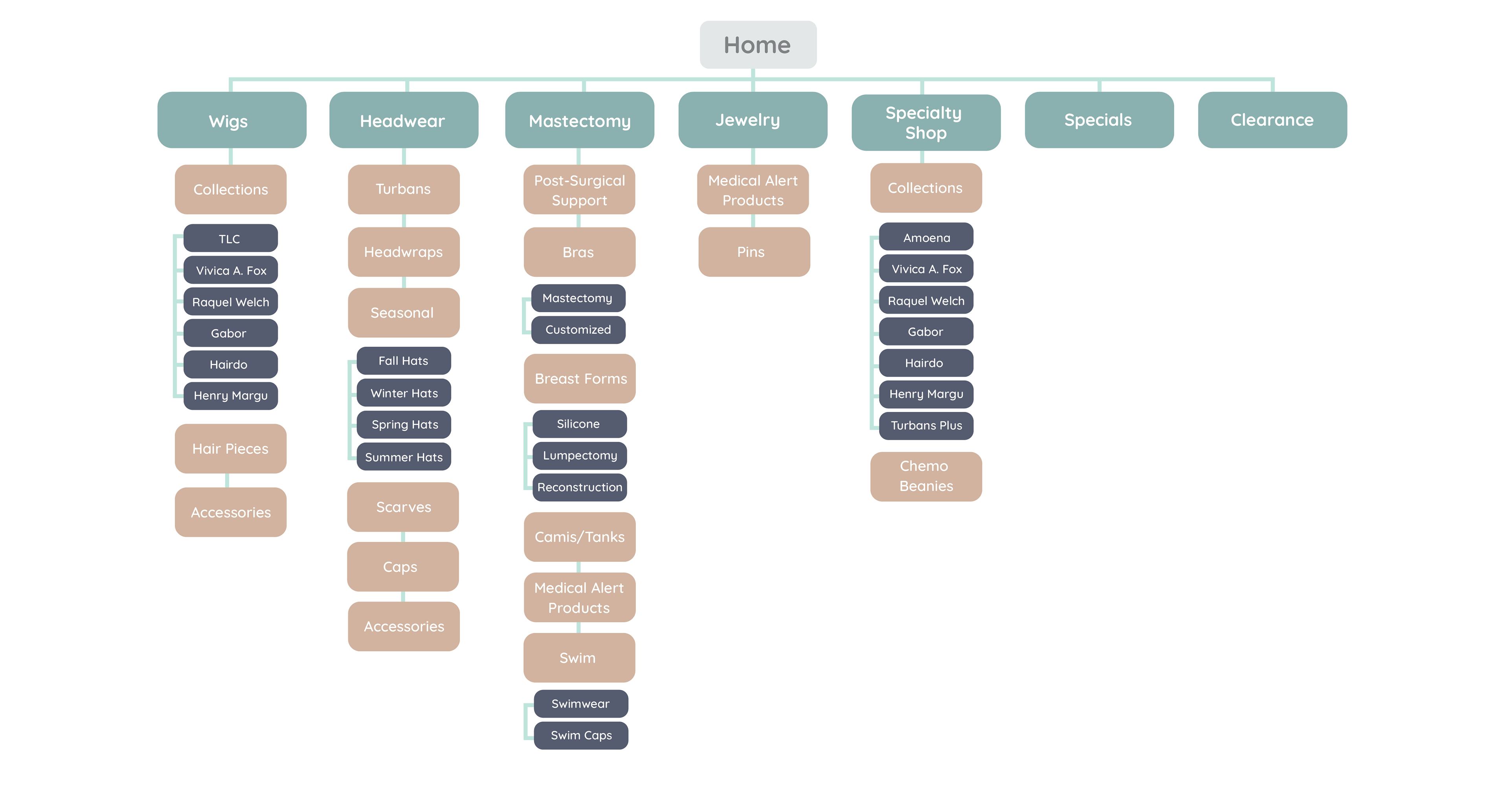
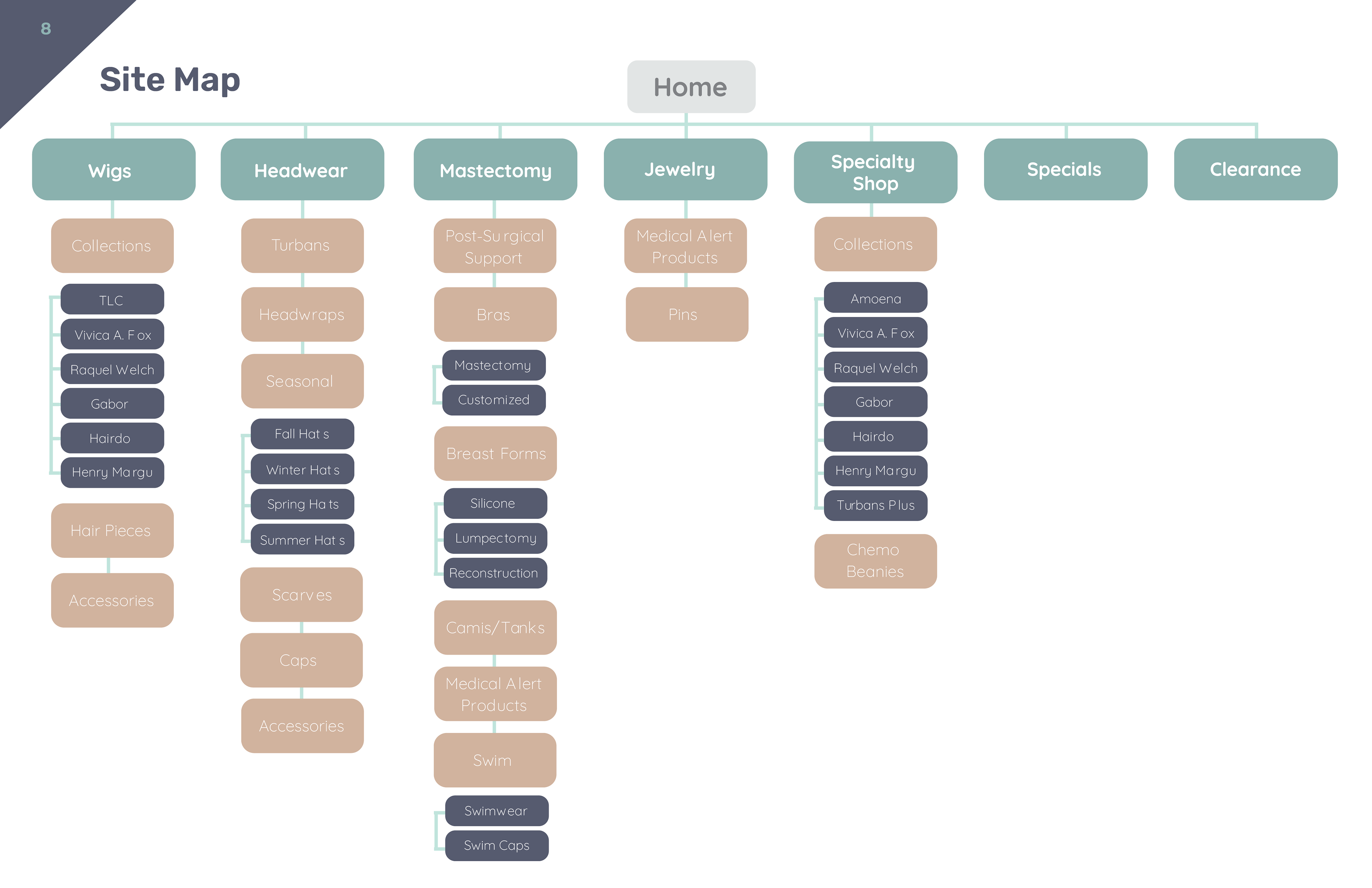
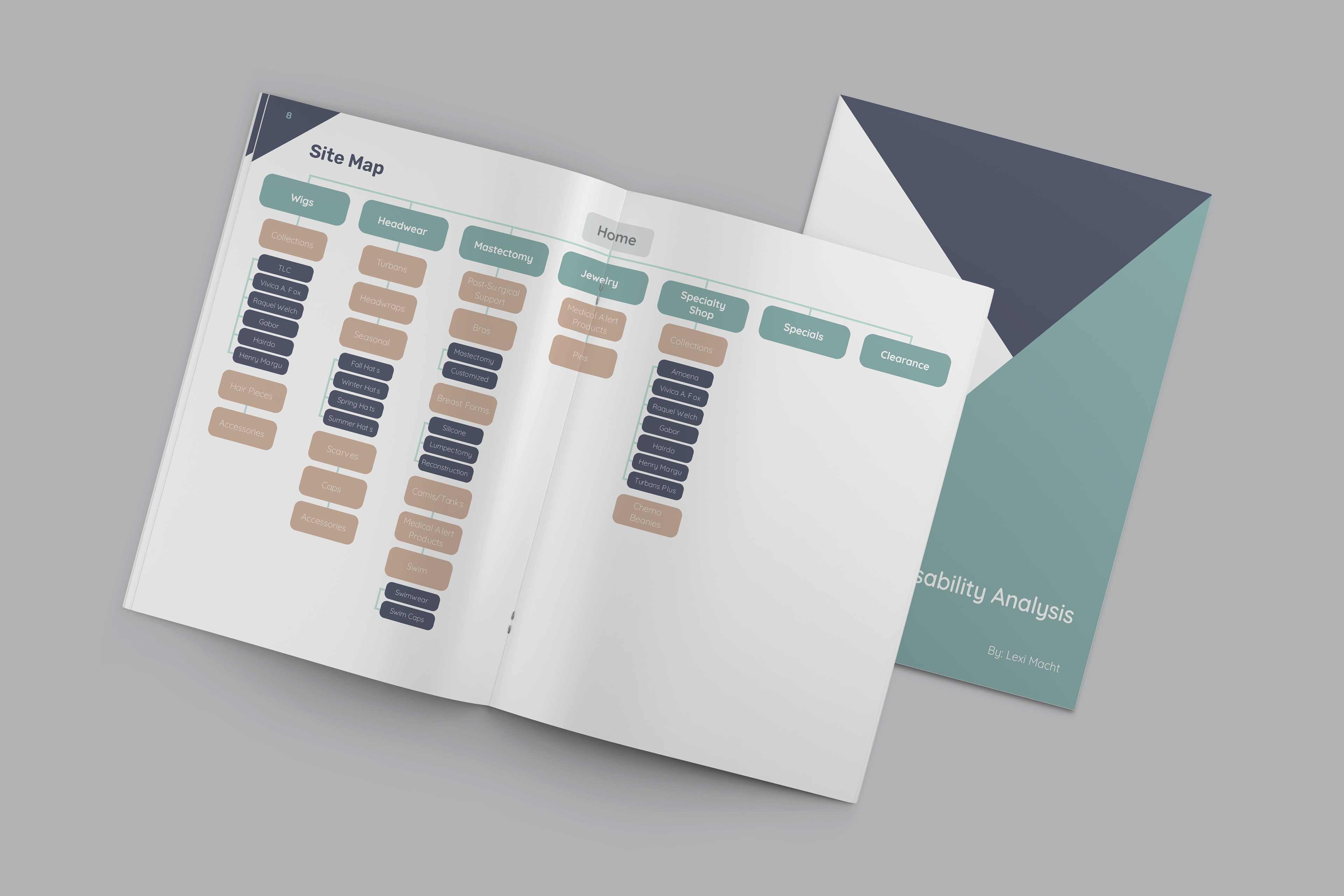
Site Map
This was a site map created by myself in Adobe Illustrator to better showcase what a new and improved navigation bar could look like for TLC's website. The mint green colored tabs would represent the main headers you would immediately see on the homepage of a website. The tan colored tabs would then represent the subcategories under the main header. Lastly, the navy blue colored tabs would represent the dropdown under subcategories if other sections were needed to display products.