About the Project
This freelance project was a company rebrand for The Costume Shop at Millersville University. This was a team effort for the entire project. We were employed with this company throughout our Junior and Senior years of college which helped with the communication part of the project with the company. They've been wanting to update their brand for a while but since businesses opened back up due to the drop in COVID-19 cases, they have been very busy. We decided to take initiative and do their rebrand for them as a way for us to gain more experience while also taking some stress off of them.
Logo
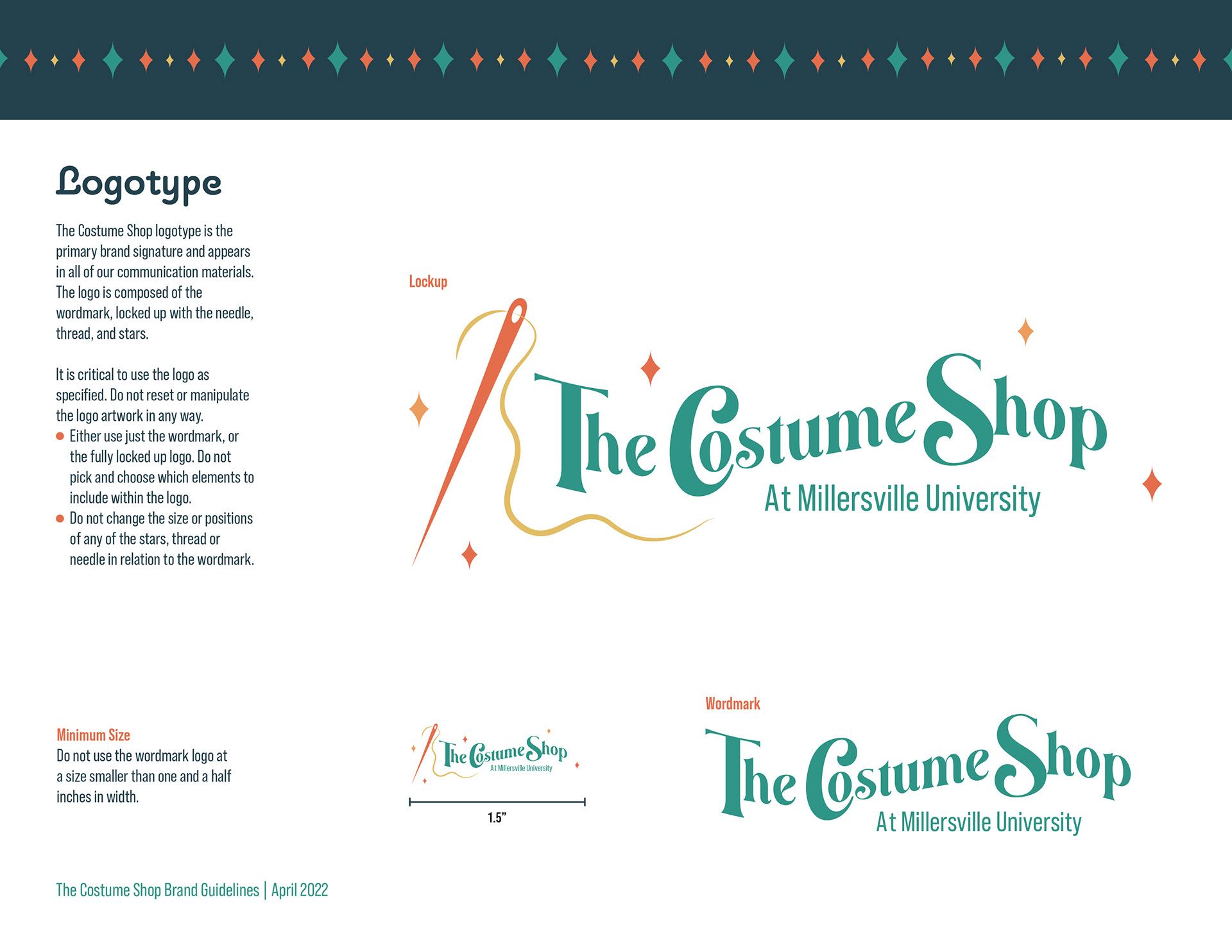
This is the final logo my partner and I came up with for The Costume Shop. It was a combination of both our ideas and illustrations which we were very pleased about. For their original logo which was a mask, we felt it didn't fully express all that The Costume Shop was about and was lacking in personality. The owner does a lot of sewing projects, alterations, etc. for costumes and we wanted to incorporate that into the logo. We wanted to go with some fun, bold colors to make it stand out more and show more of a connection that The Costume Shop has a wide variety to choose from.
Style Guide
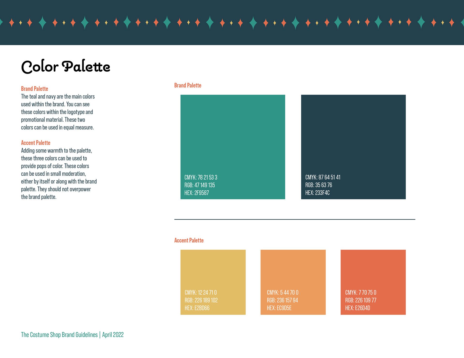
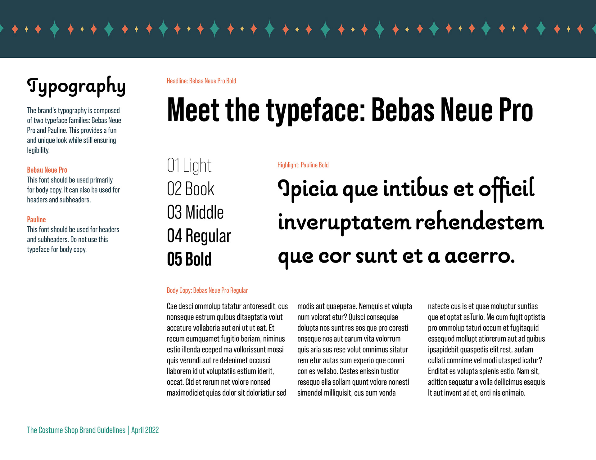
This is the style guide we created before diving into any of the branding elements to make sure we established a cohesive and consistent design throughout each product. Provided in the style guide is a black/white and colored version of the logo, the typefaces used, patterns to add some extra depth to certain designs, and our color scheme.
Business Card
Next, we moved on to the business card design as we wanted to make sure The Costume Shop was satisfied with this type of style before creating more products. We felt the darker background really helped the logo, pattern, and text pop out at you and gave a nice contrast throughout.
Customer Form
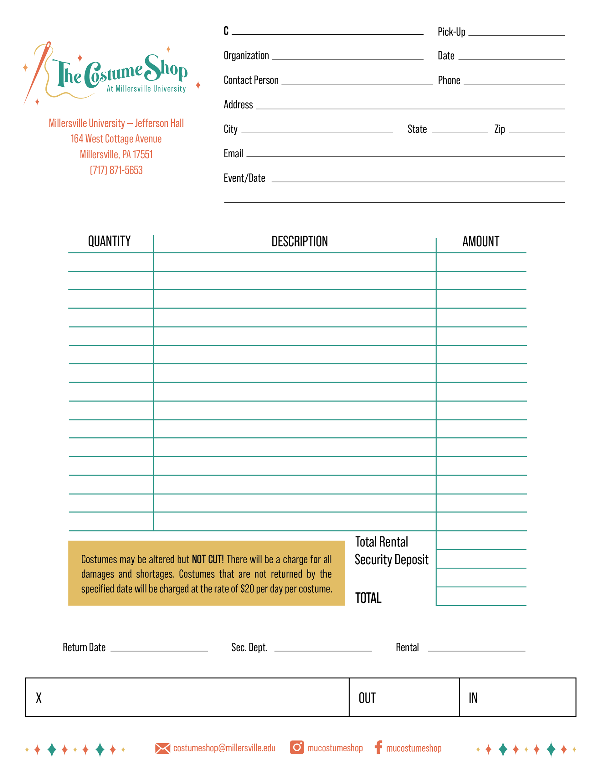
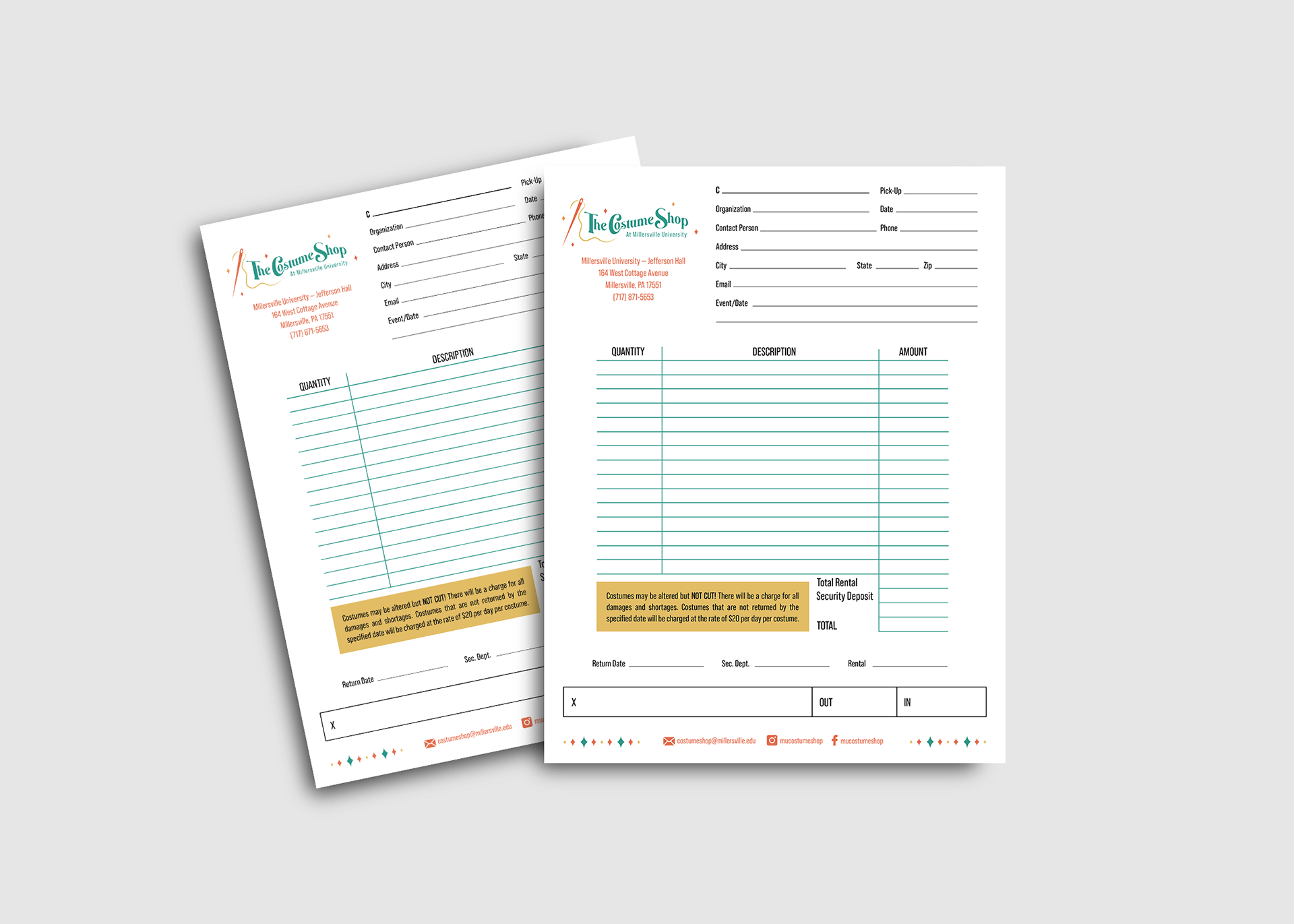
When a customer comes in and decides on renting a costume, the owner or another employee will fill out a form. This helps to keep track of everyone who has rented/for how long, how much the customer owes, and if any alterations need to be made prior to the event the costume will be needed for. Below is the updated version of the customer form we created. Their original form was all black/white and was lacking in style. We decided to add in a pop of color to make certain information stand out more while also being more eye-catching to not only the customer but to The Costume Shop as well.
Tags
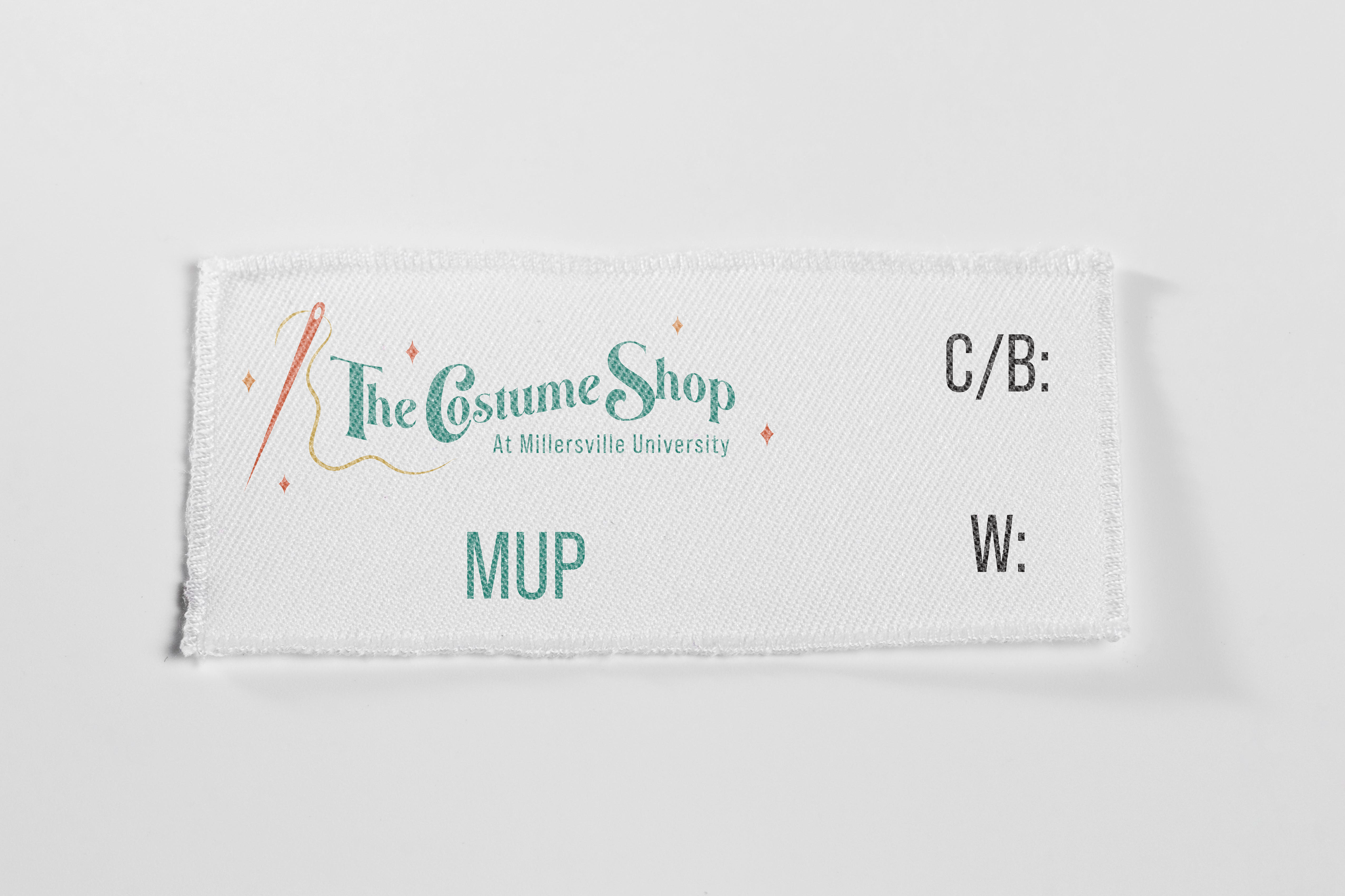
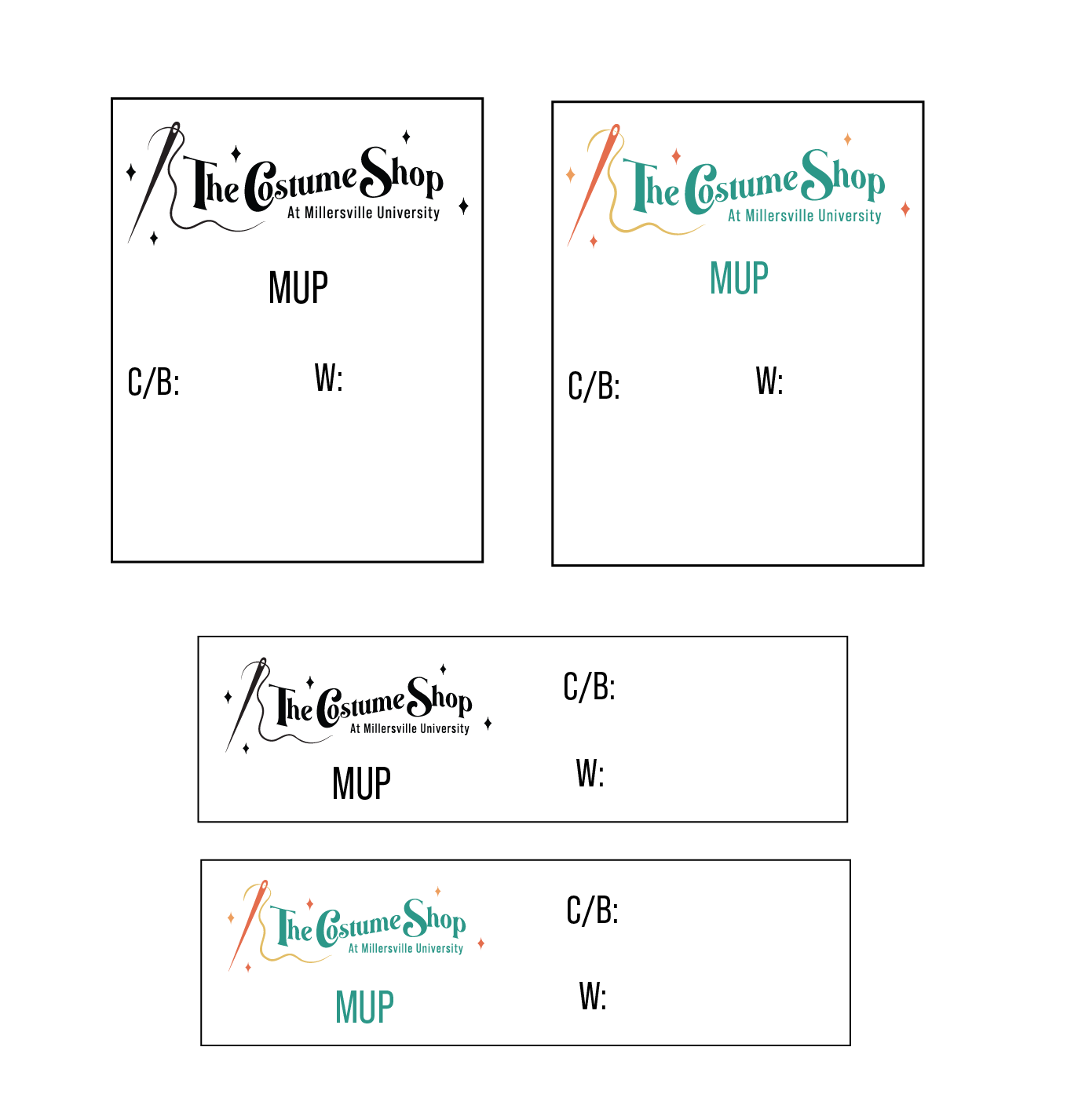
Below are some tags we created for them that will be sewn into the costumes. This establishes that it is Millersville University Property (MUP) and allows room for the employee to write the size of either Chest (C), Bust (B), or Waist (W). Their original tags were a strip of ribbon and we had to write out everything. This updated tag looks more professional and gives more attention to The Costume Shop as a whole.
Email Signature
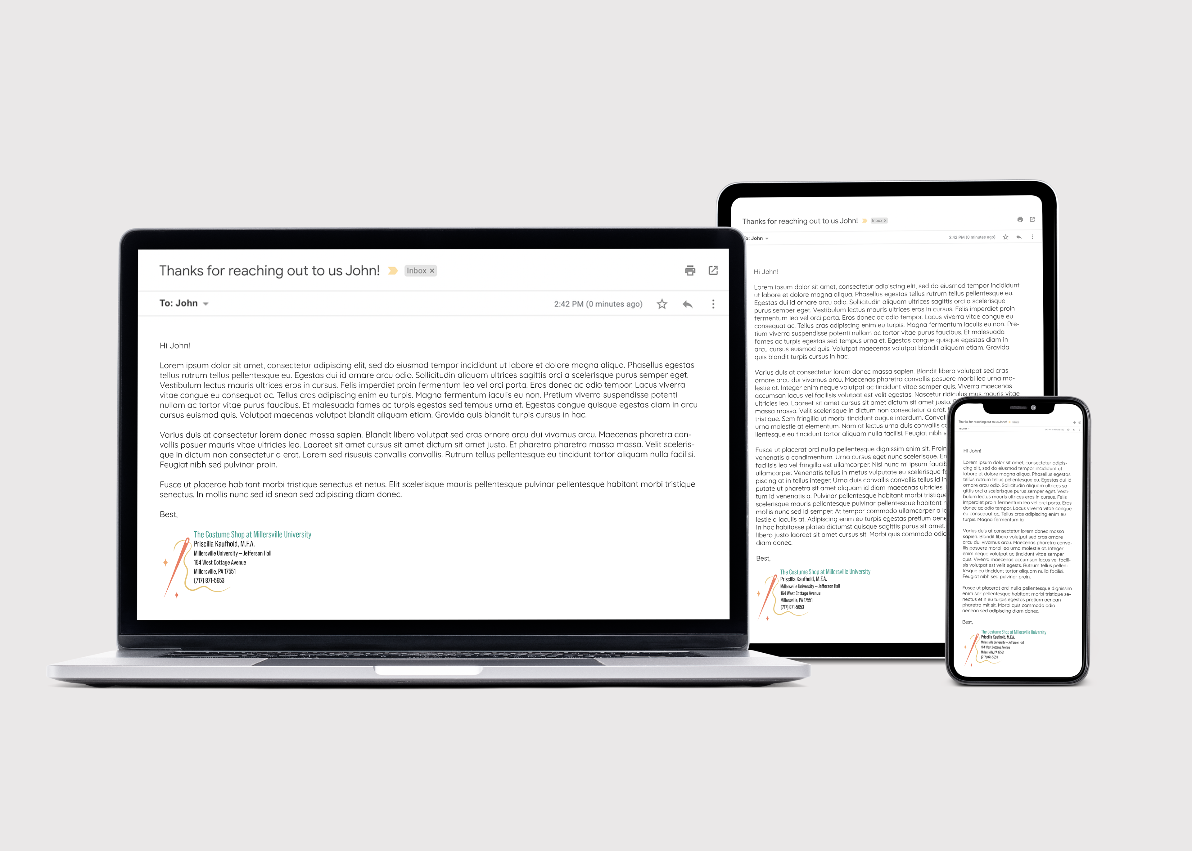
Another thing we created was an updated version of an email signature. This is found at the bottom of an email that The Costume Shop would send out to a client. We decided to add a fun element to the email signature by including the thread/needle illustration along with some stars to connect back with the brand as a whole. We wanted the name of the company to stand out which is why we made the title the green found within our color scheme. We also decided on making the owner's name slightly bigger than the rest of the information so it is easily recognizable to the customer.
Promotional
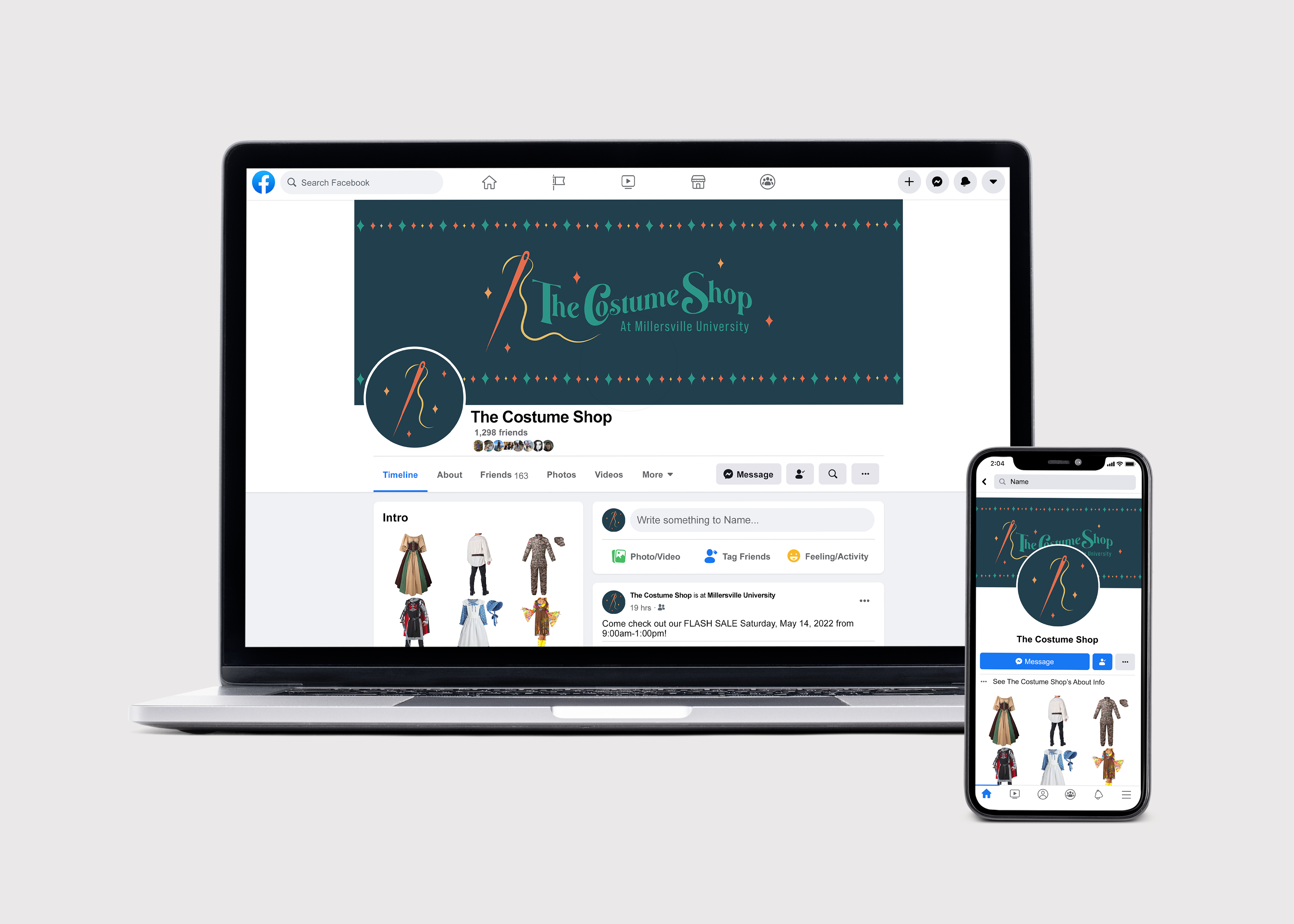
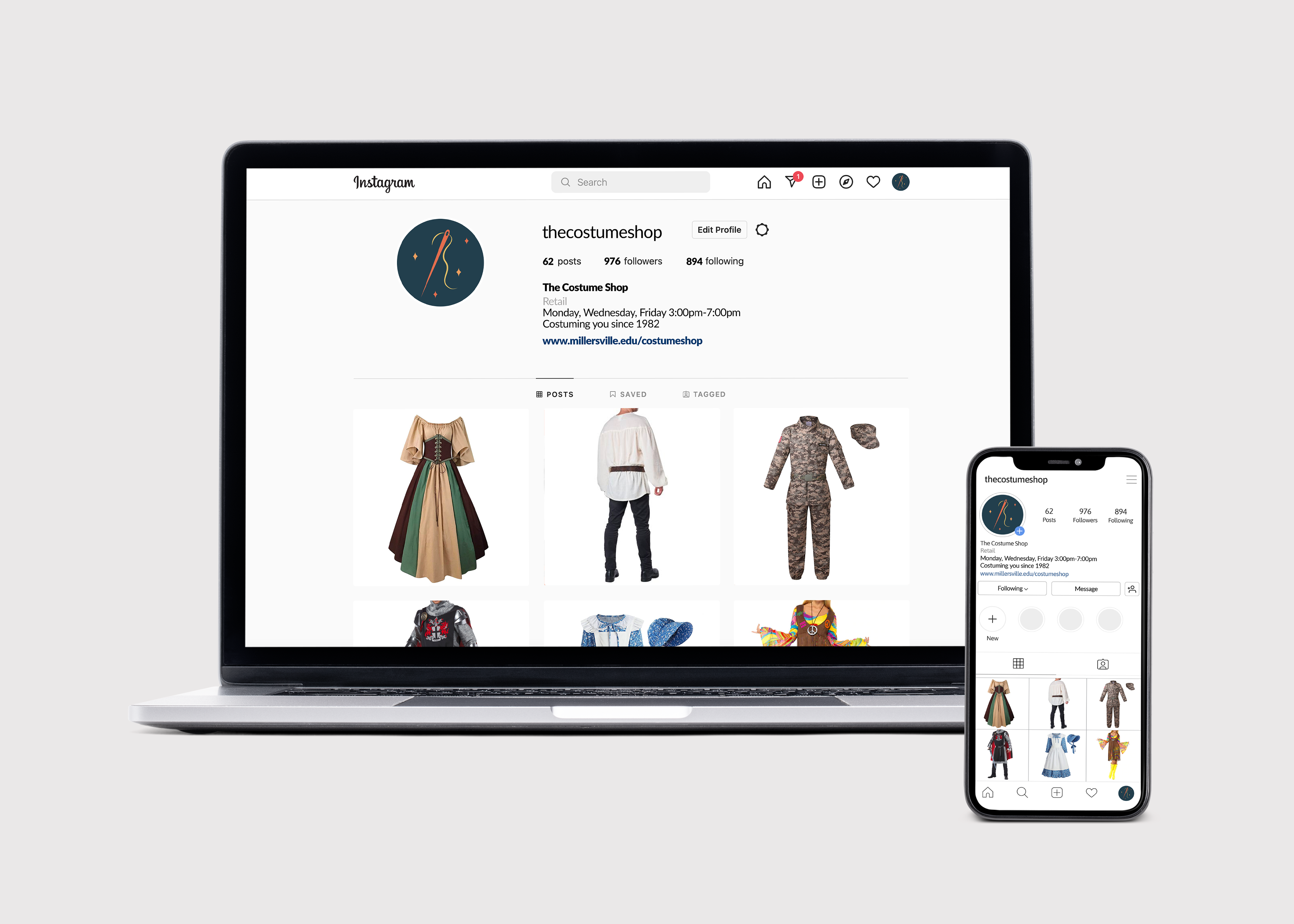
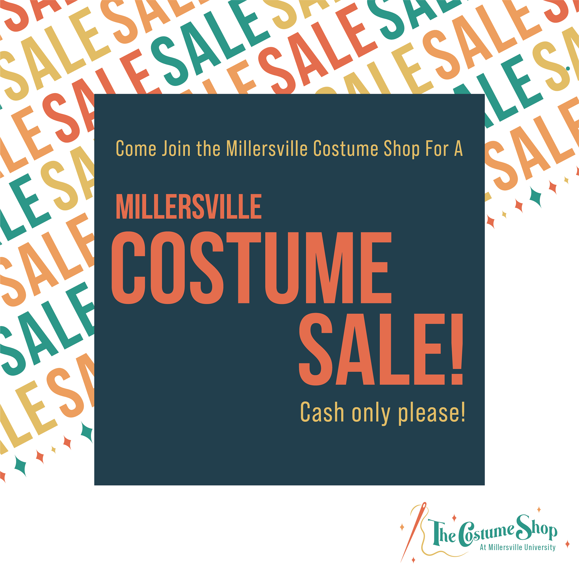
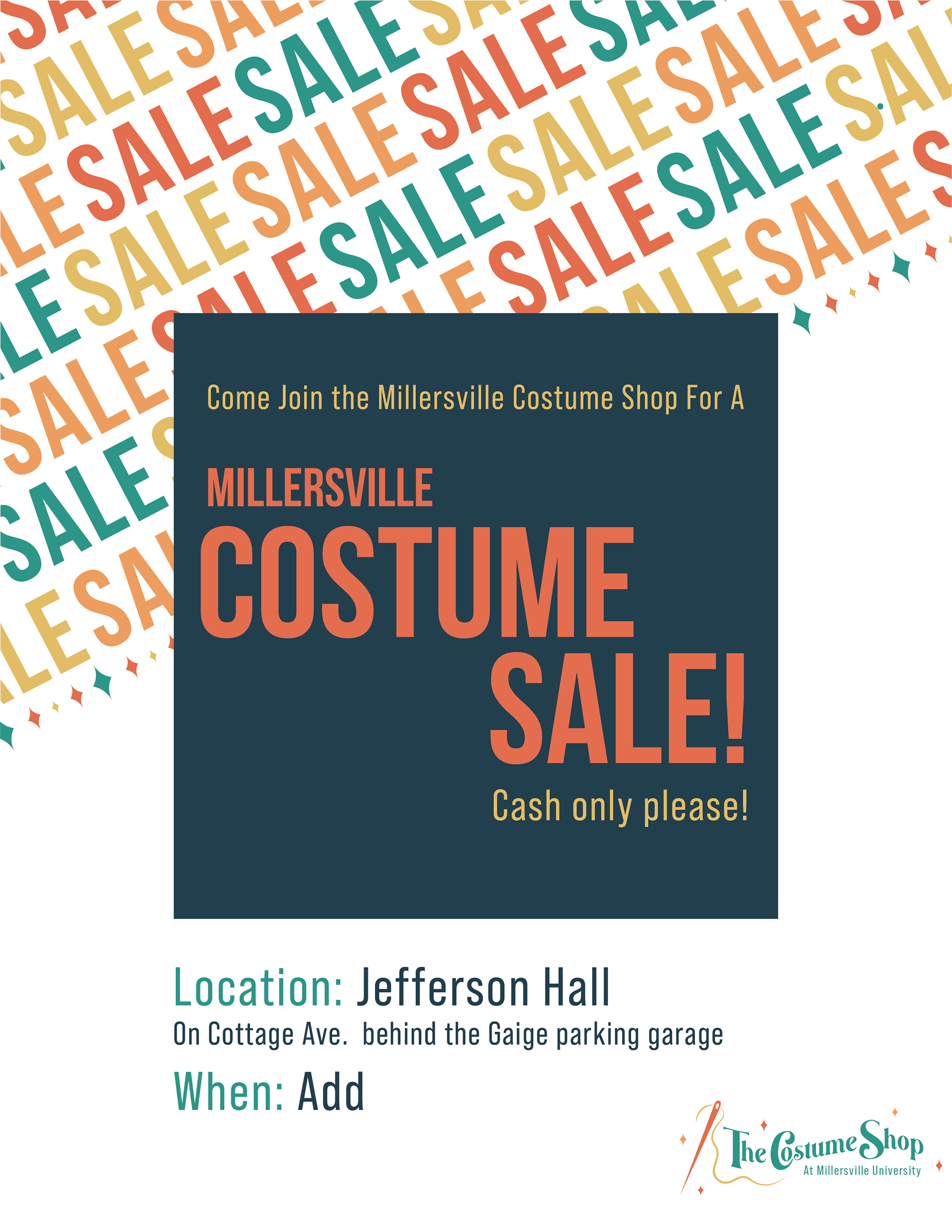
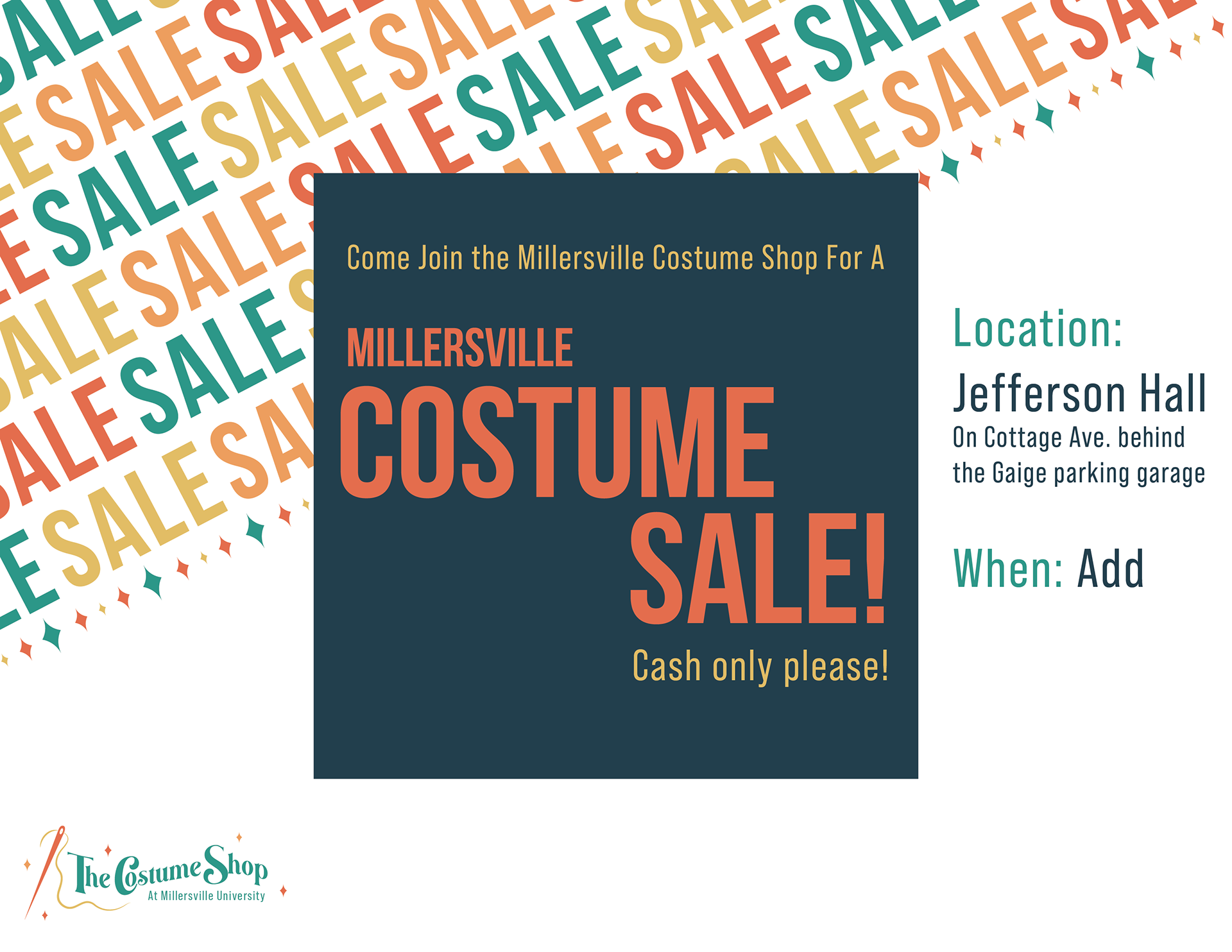
We created some sample mockups of what The Costume Shop's Facebook and Instagram profile pages could look like with the updated brand. We also created some flyers they could post to inform people of upcoming sales that could be happening. All they would need to do for their portion of it would be to include the information about the sale (day/time).

Stationery
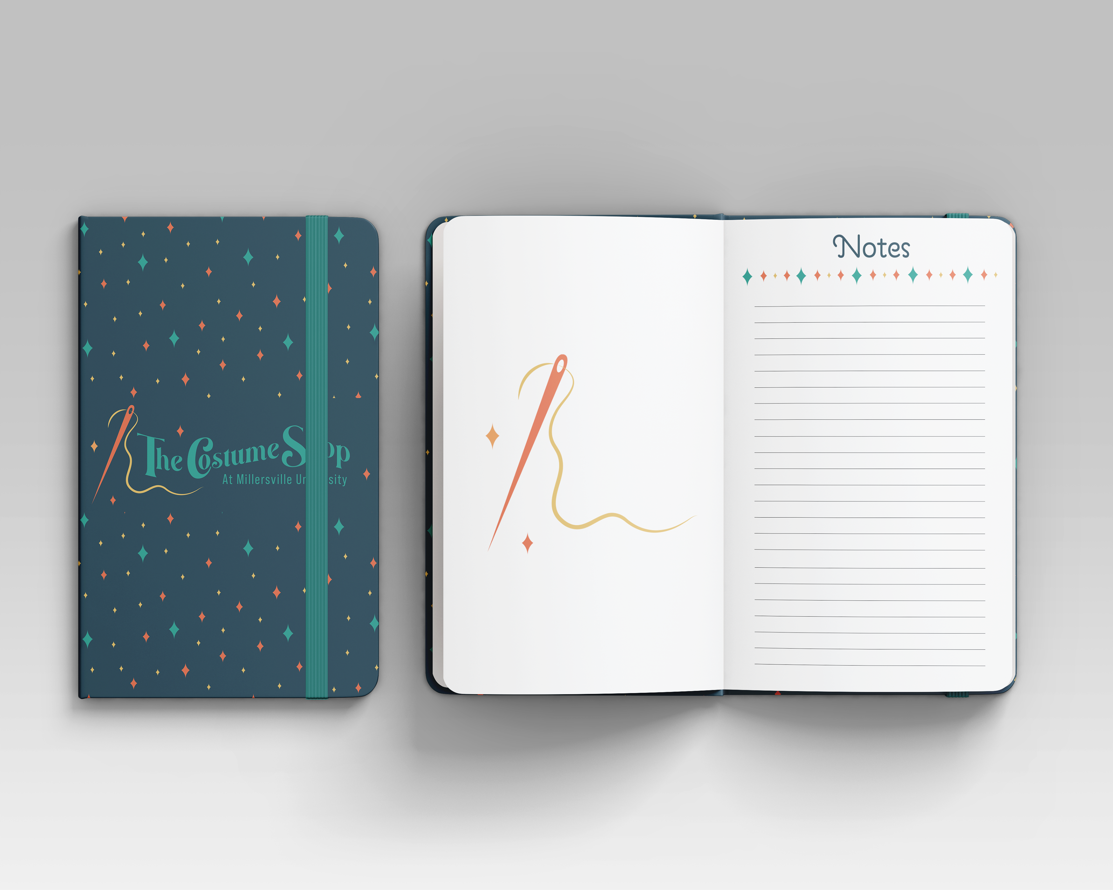
We also created some sticker mockups for The Costume Shop as a way to add in a fun element for customers to take with them. Additionally, there is a notebook mockup for customers to either purchase or for The Costume Shop to have to write down any information when needed.
Signage
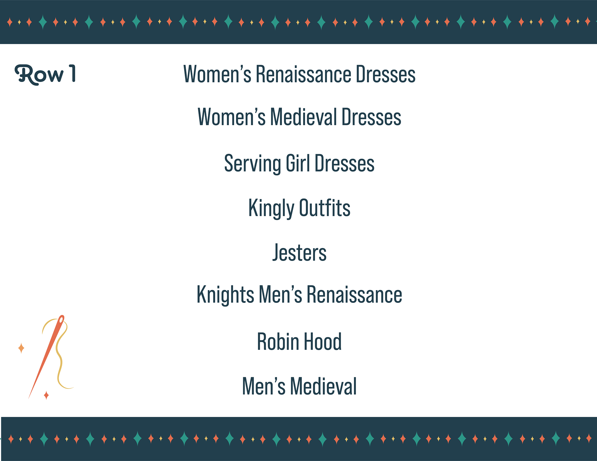
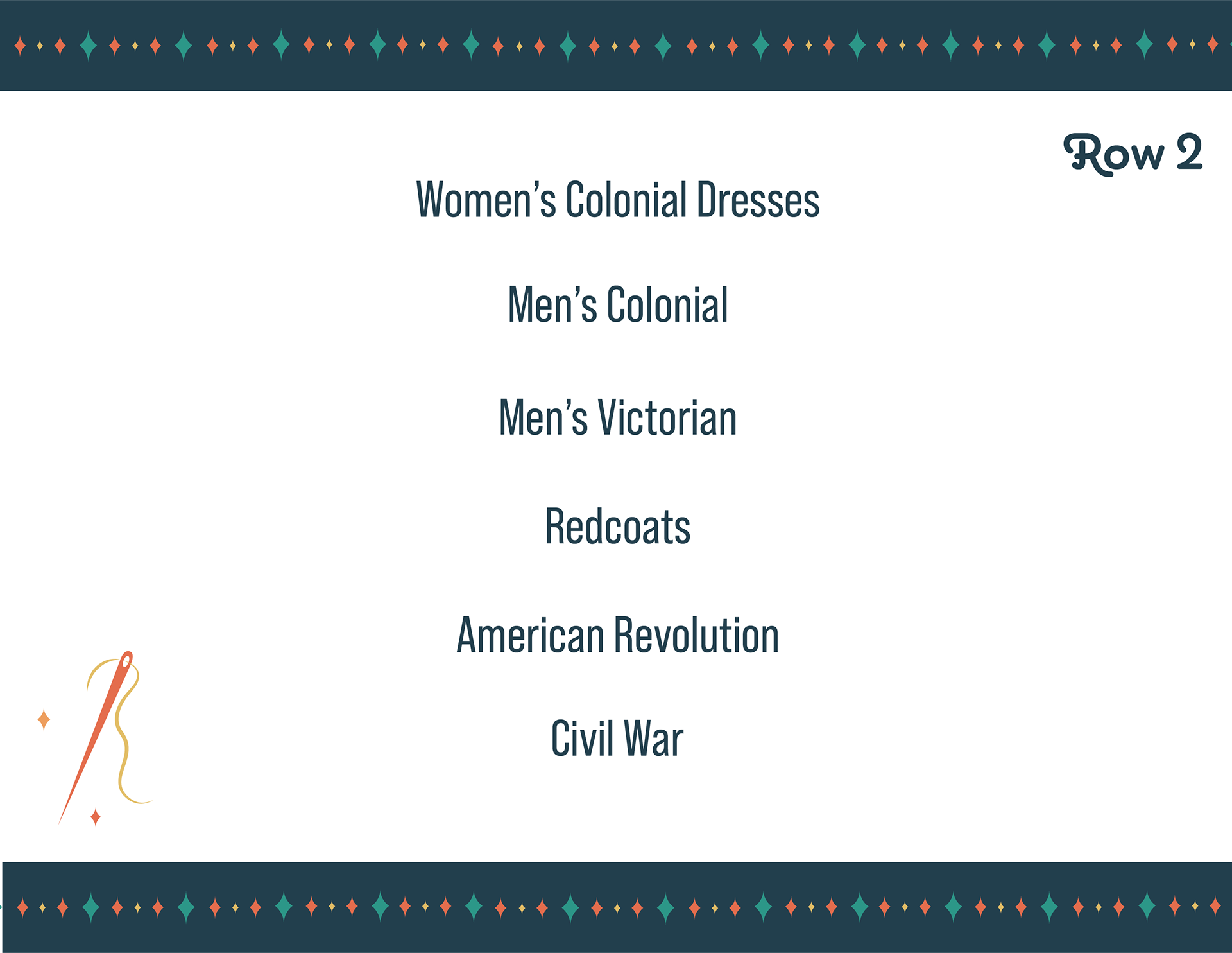
The Costume Shop has signage in front of each aisle to allow the customers to have a better experience when looking around. This signage helps to pinpoint exactly what you will find in each row as there are thousands of costumes to choose from. Their original signage was just black/white and wasn't up to date as costumes were moving around. We decided to make them more appealing to the eye and easier to navigate through each section.
Brand Guidelines
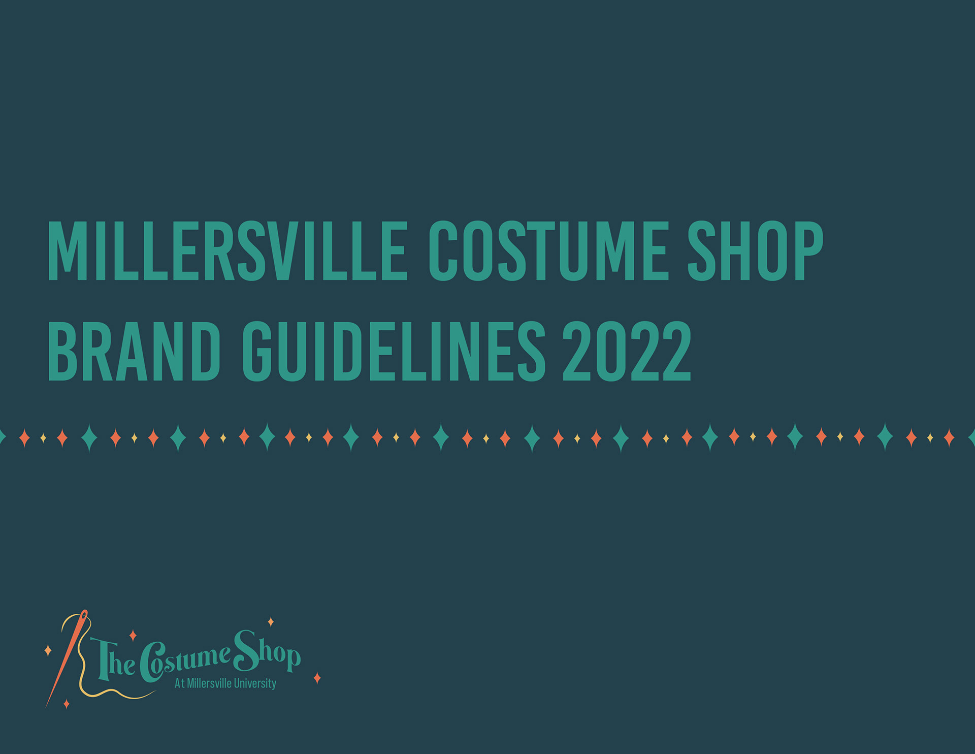
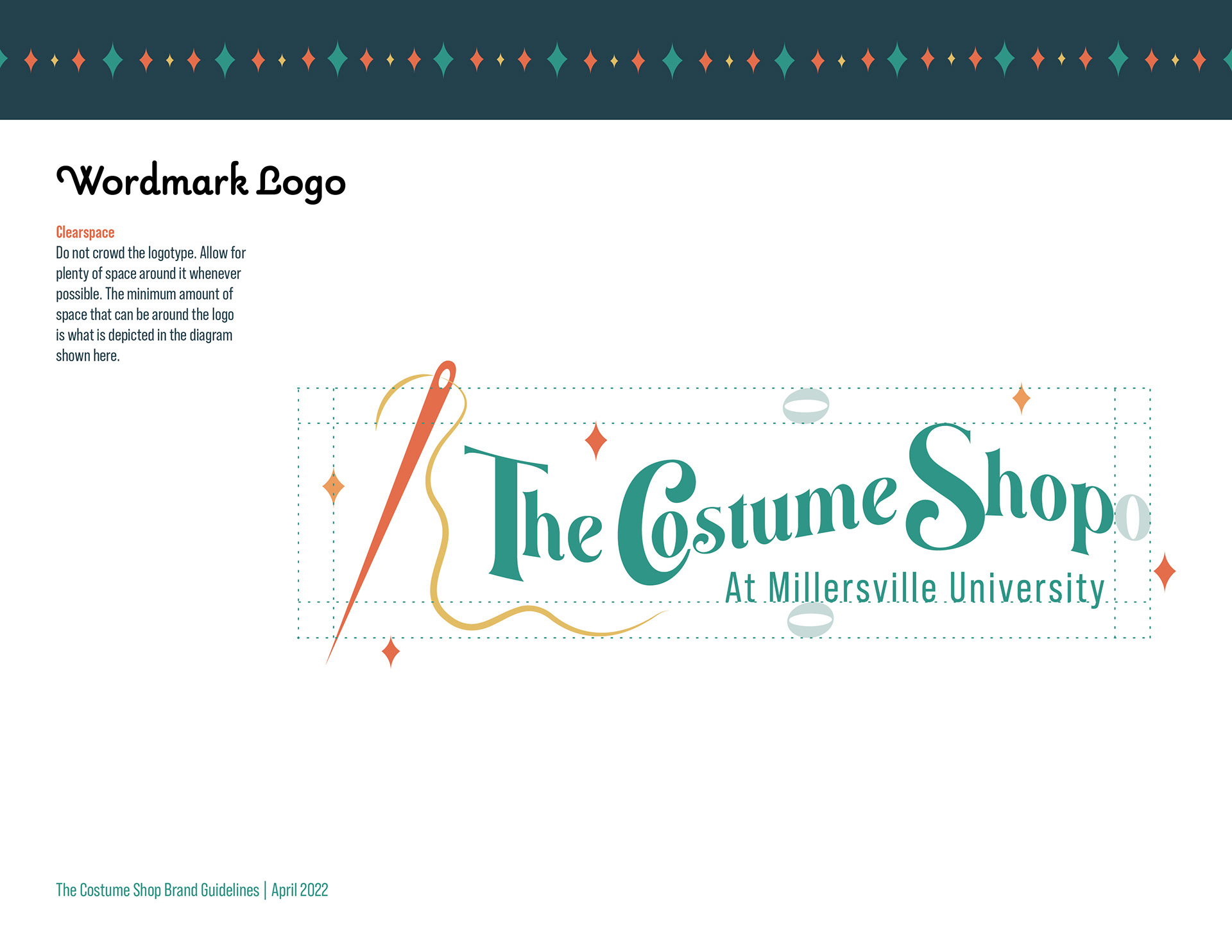
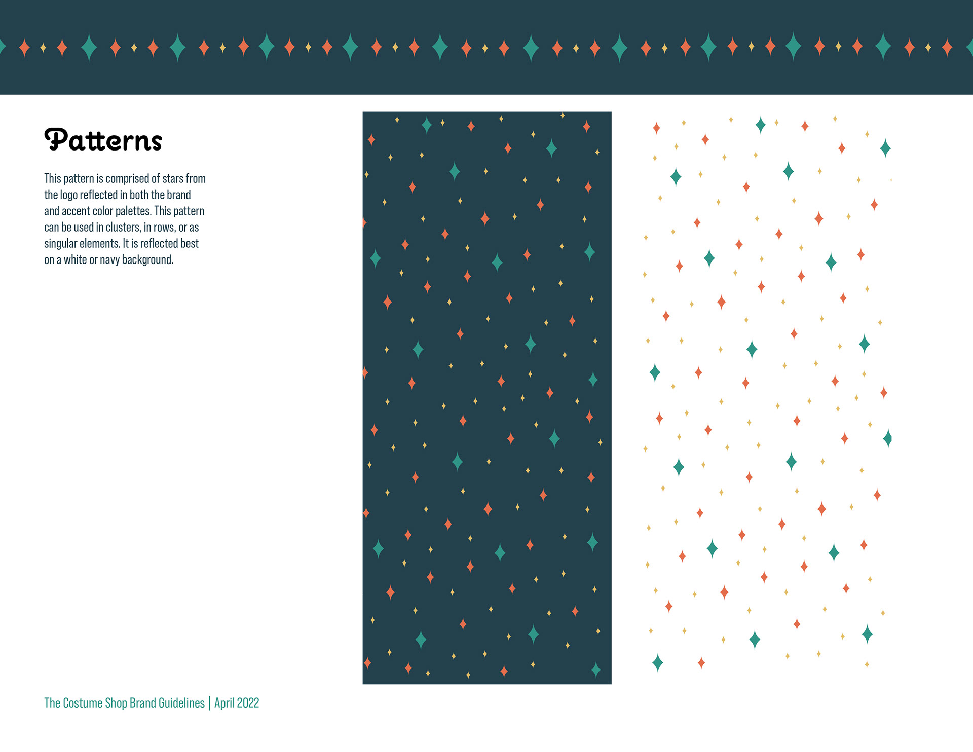
Below are guidelines that were created to help the employees moving forward with the brand as a whole. This will help to keep consistency throughout and assist the employees with the visual details and language to ensure the brand is being communicated effectively.
Contributor
