
About the Project
We were given a topic that was drawn out of a hat and needed to make a full brand identity for it. I ended up getting “Family Doctor” and immediately went to work researching this topic. I began brainstorming names for the company and after several options, I decided on the name Remedy. It seems soothing/inviting enough to the public but has a correlation to the medical field which is what I was trying to get at.
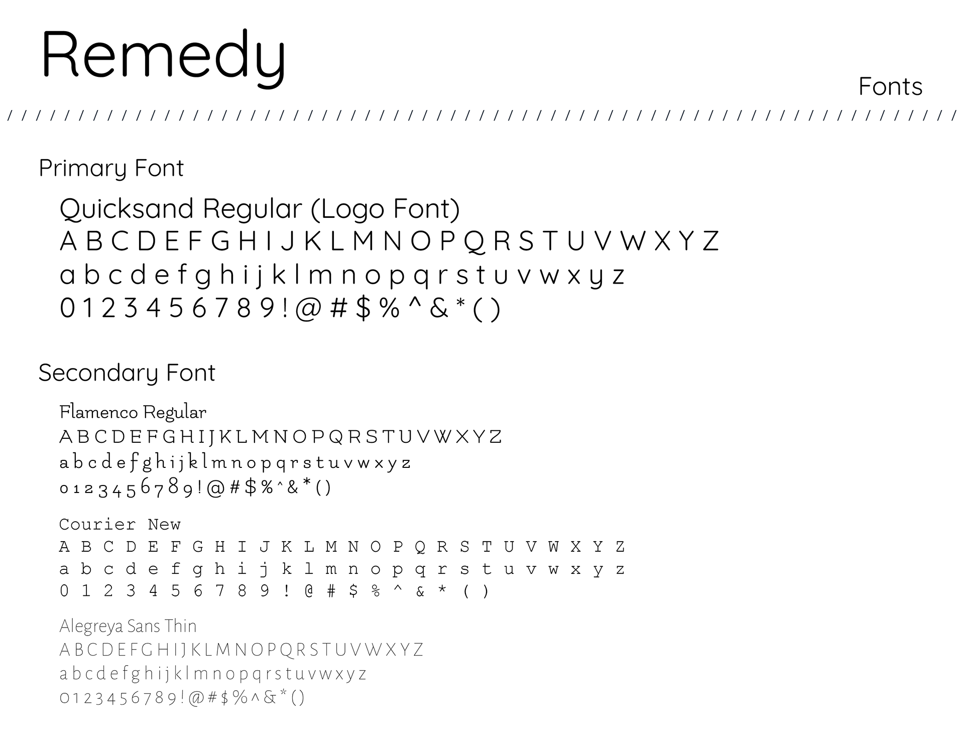
Thought Process
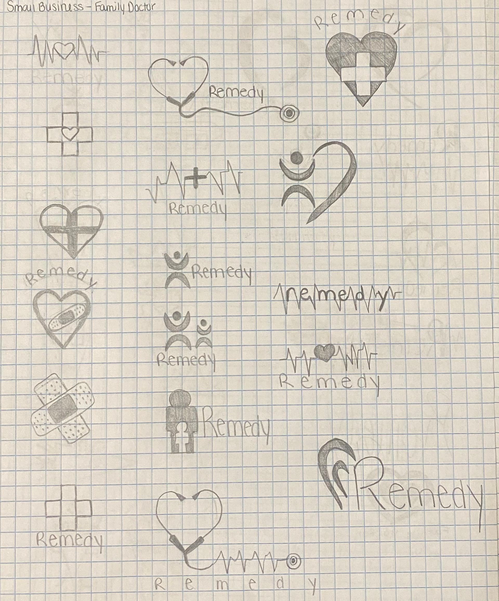
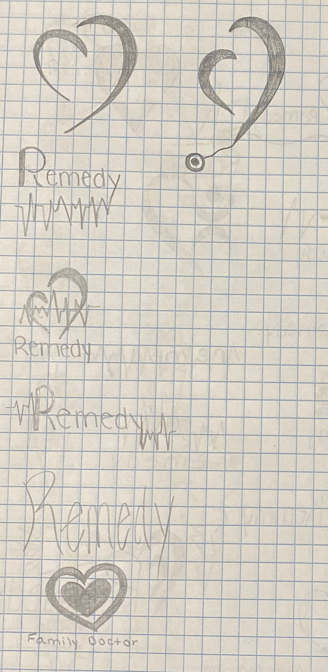
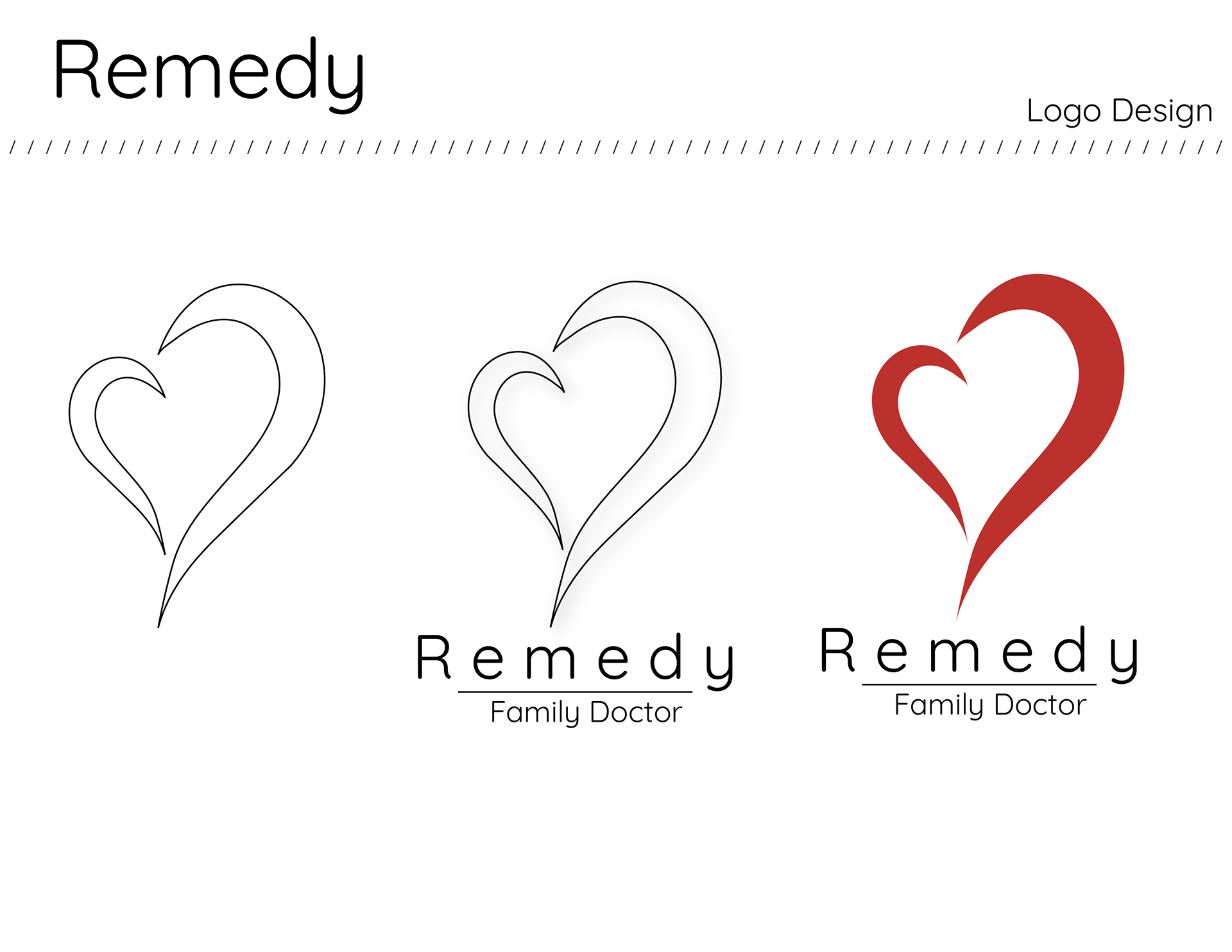
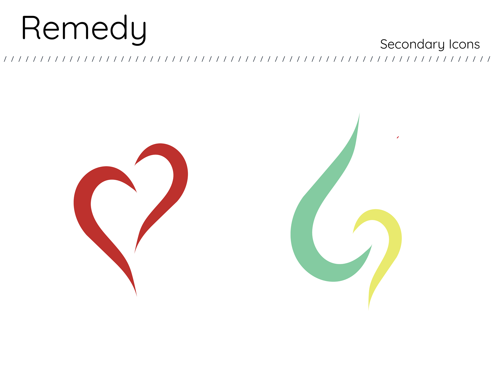
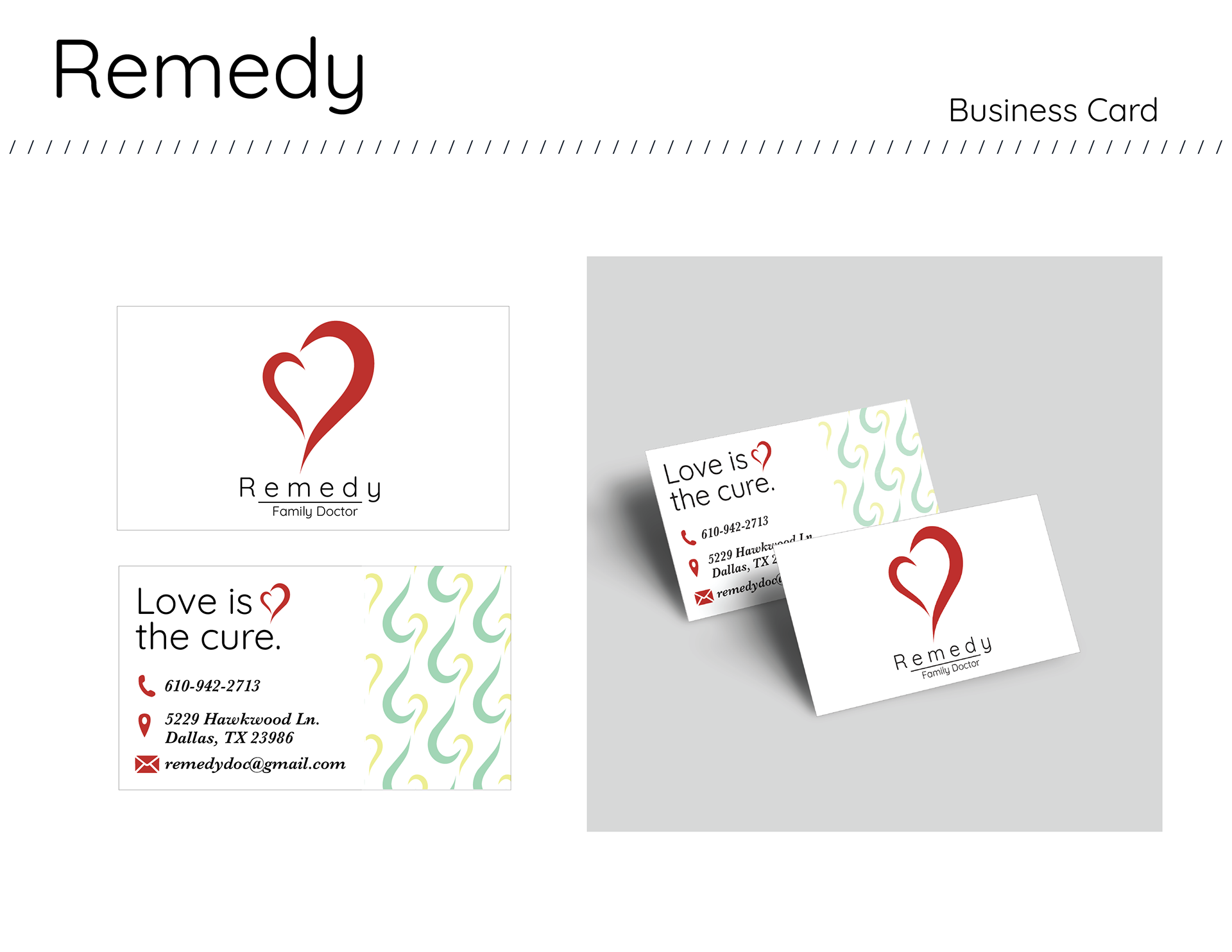
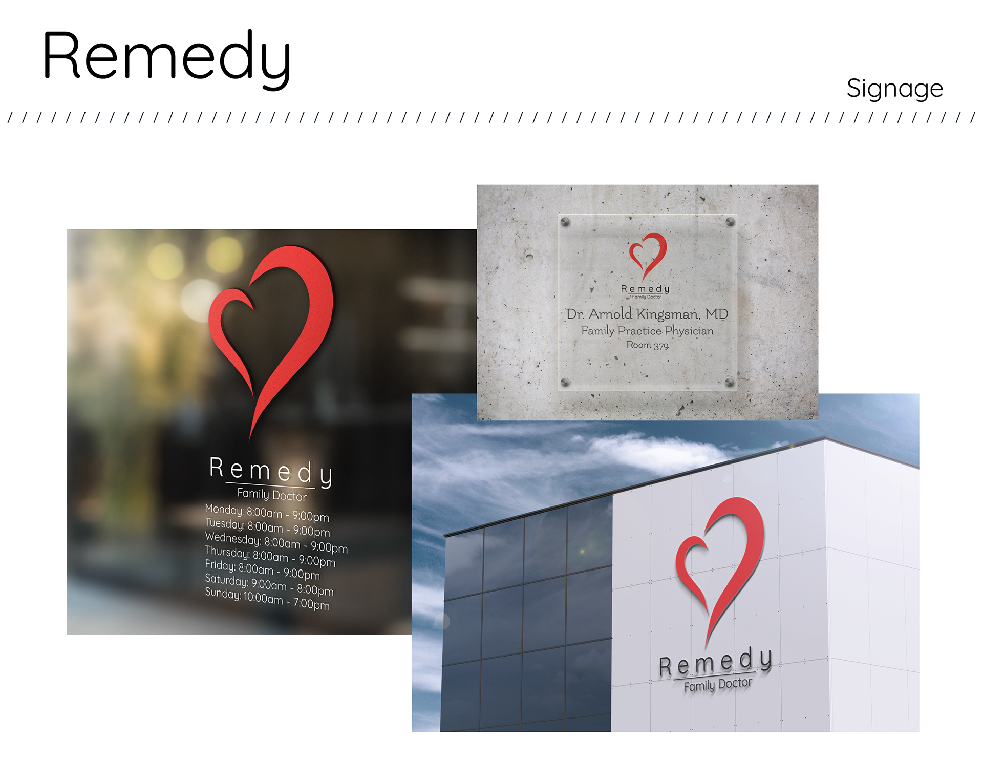
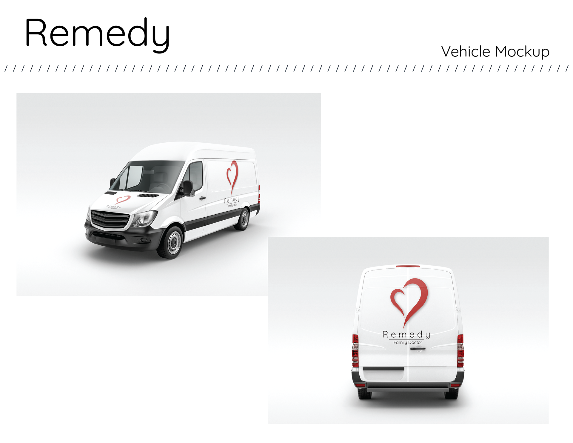
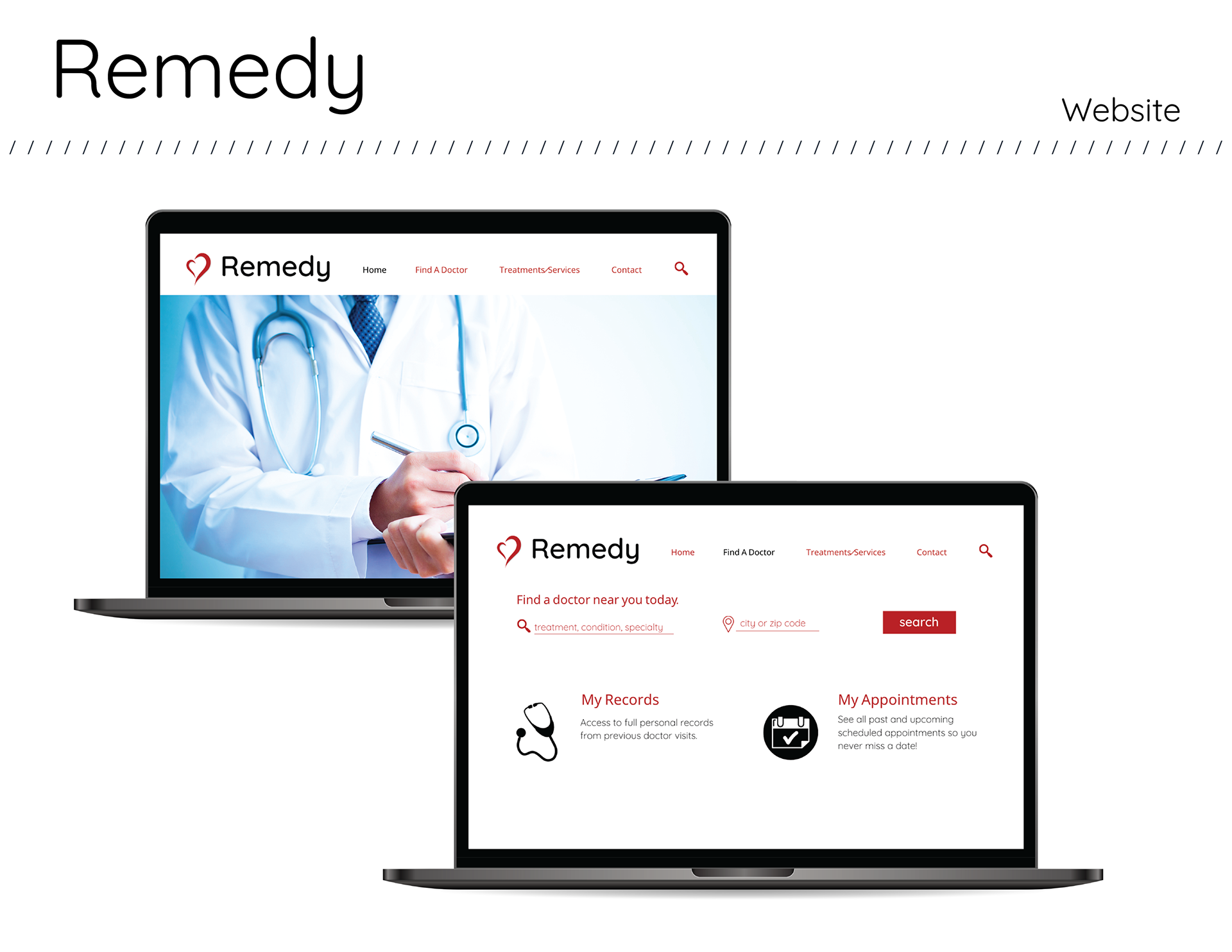
Moving onto the logo, I didn’t want anything too basic or too similar to other medical logos. I sketched out a bunch of different options, but kept coming back to a heart shape as I wanted the slogan for the business to be "Love is the Cure." The heart would help make the business feel very warm, welcoming, and inviting while also giving reference to the slogan.

Animated Logo
Here is a quick and simple animated logo for Remedy Family Doctor. I decided to keep it straightforward to get the company name out there as timeless as possible for the audience to see. I wanted the logo to be very inviting and help tie into the flow of the heart more with the animation.