
About The Project
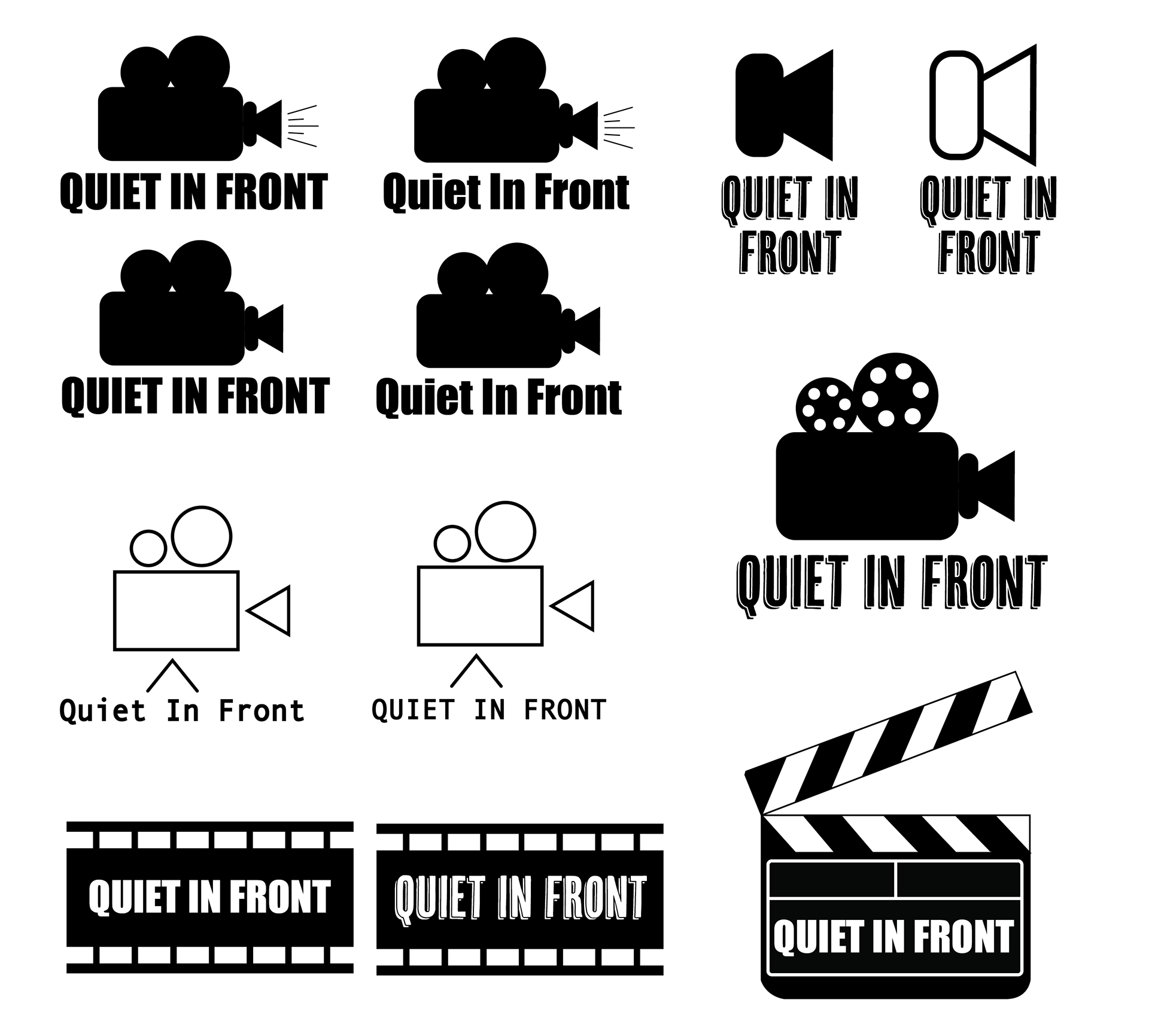
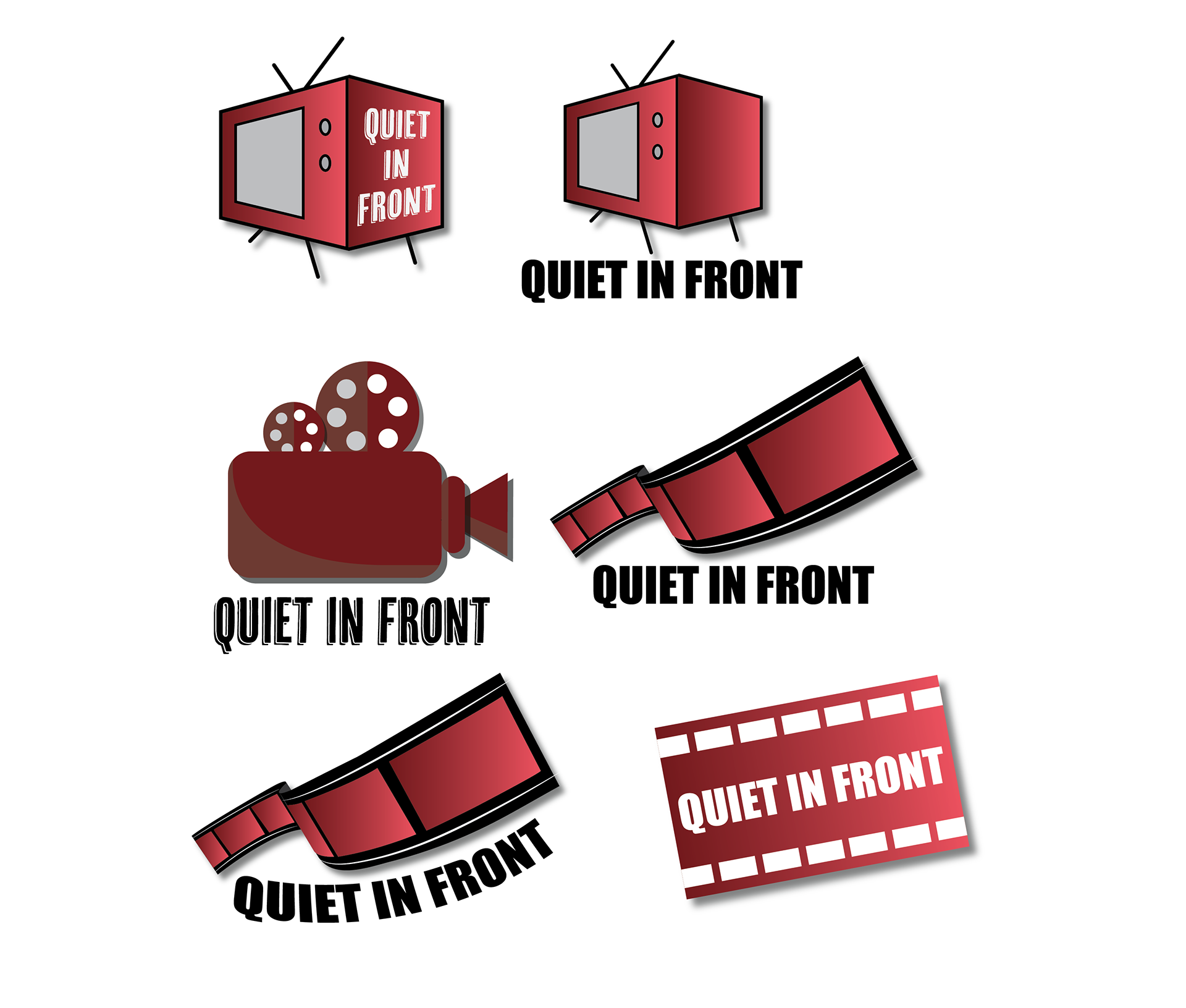
This project involved updating Quiet In Front's current logo (shown on left) for the podcast they have on Spotify. The client wanted the new logo to still relate to movies/watching movies in a sense as that is the main theme of their podcast. It was asked whether they want to keep their existing font choice or if permission was granted to explore other options. It was preferred and easier to produce rough digital versions rather than sketches for the client as it was easier to gain a full visual of what it could look like as the final result.
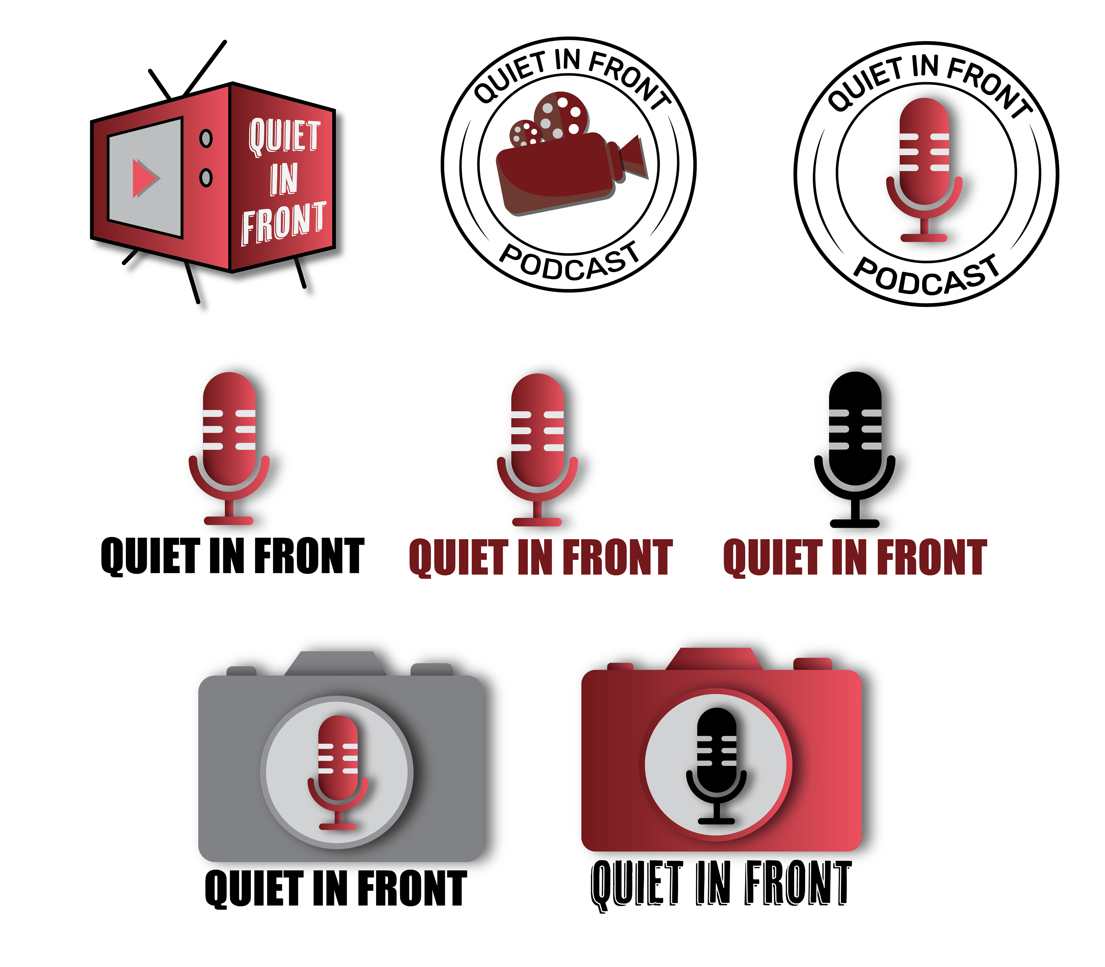
The first set of logos (left) made the client want to break away from flat logos and add more depth to them. They also established that they want to try to keep the current color scheme as well rather than black and white. The next set of logos (middle) was moving more towards the vision they wanted but still asked for a few more ideas as they wanted to see what else is out there to make sure they were fully satisfied. The last set (right) helped the client understand more of what they wanted and asked to combine a few elements from separate logos. After doing that, the final logo was then produced.
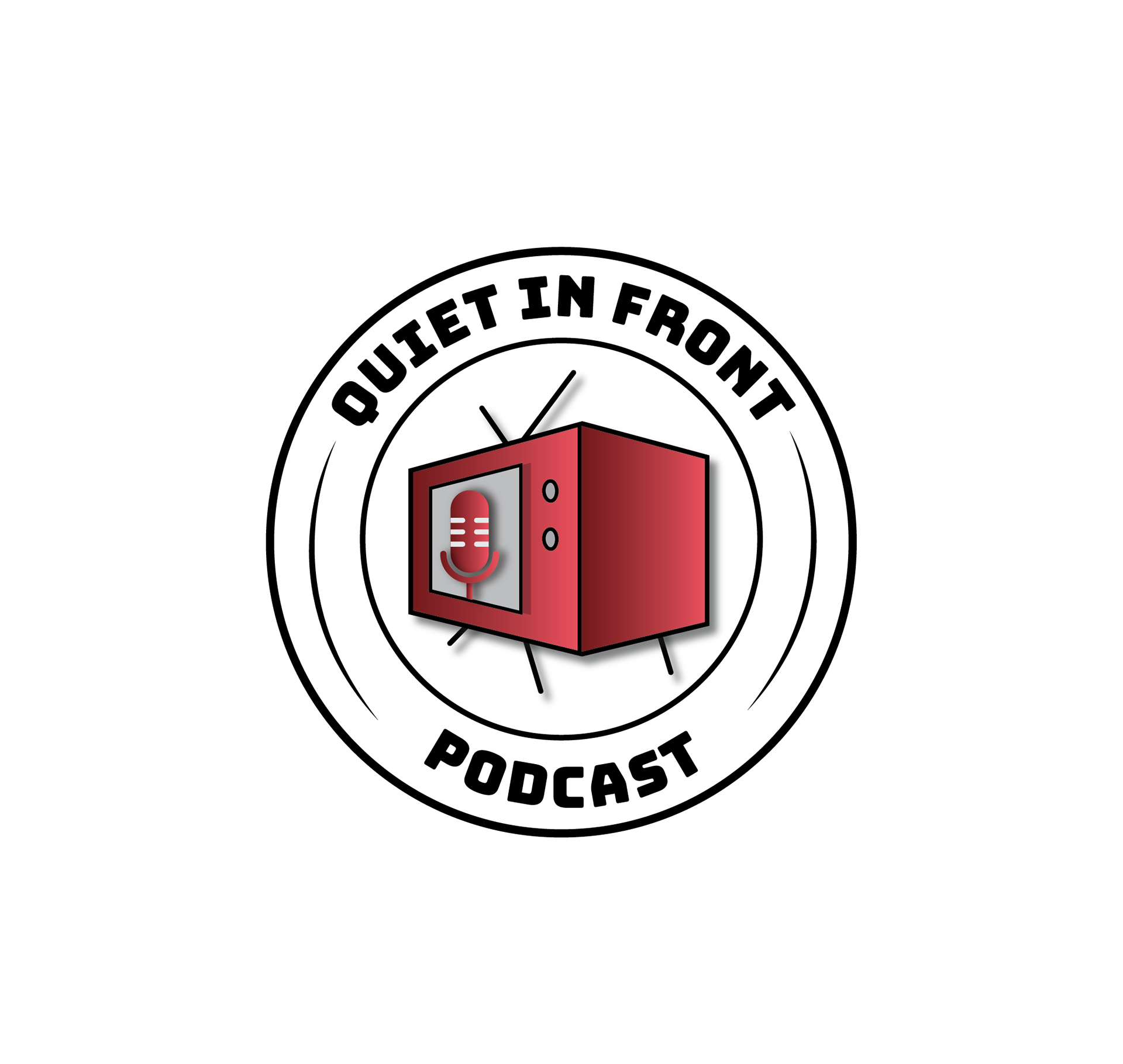
Final Logo
To the right is the final logo the client agreed upon and was fully satisfied with. It was a combination of 3 separate logos seen in the set on the right above. We decided to stick with the same font as it looked and fit best within the circular element when putting together the final logo.
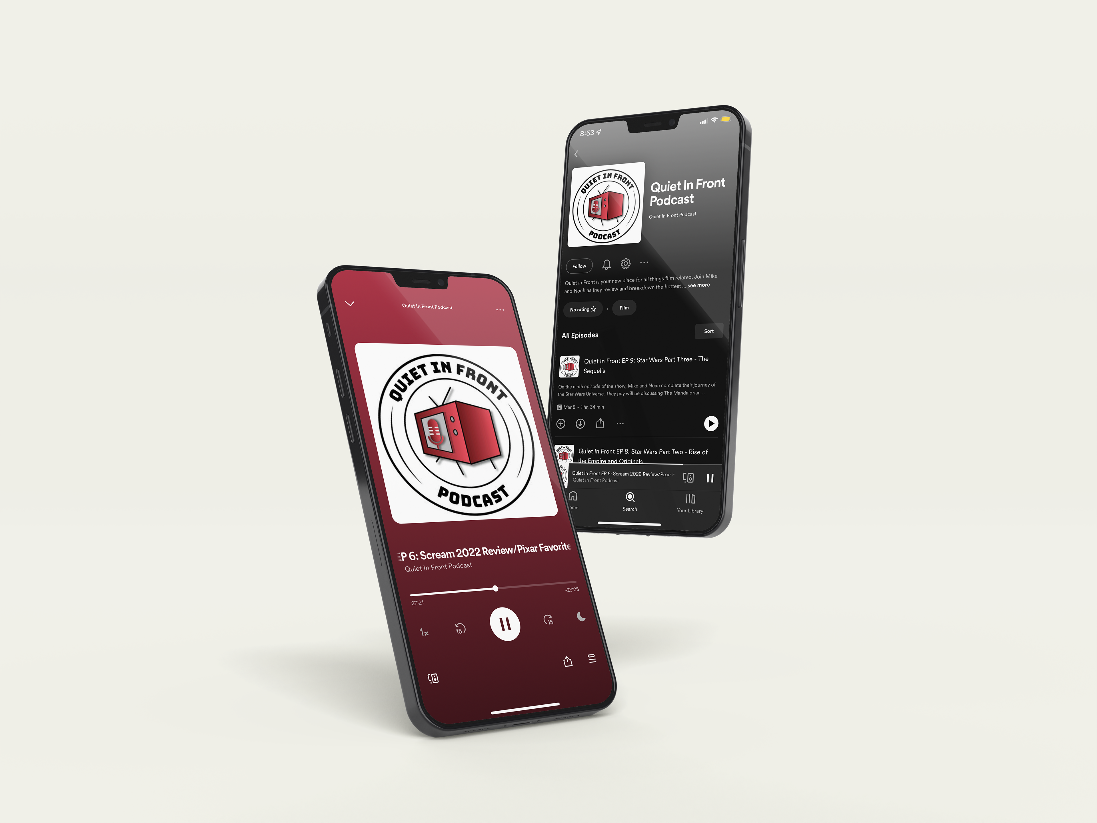
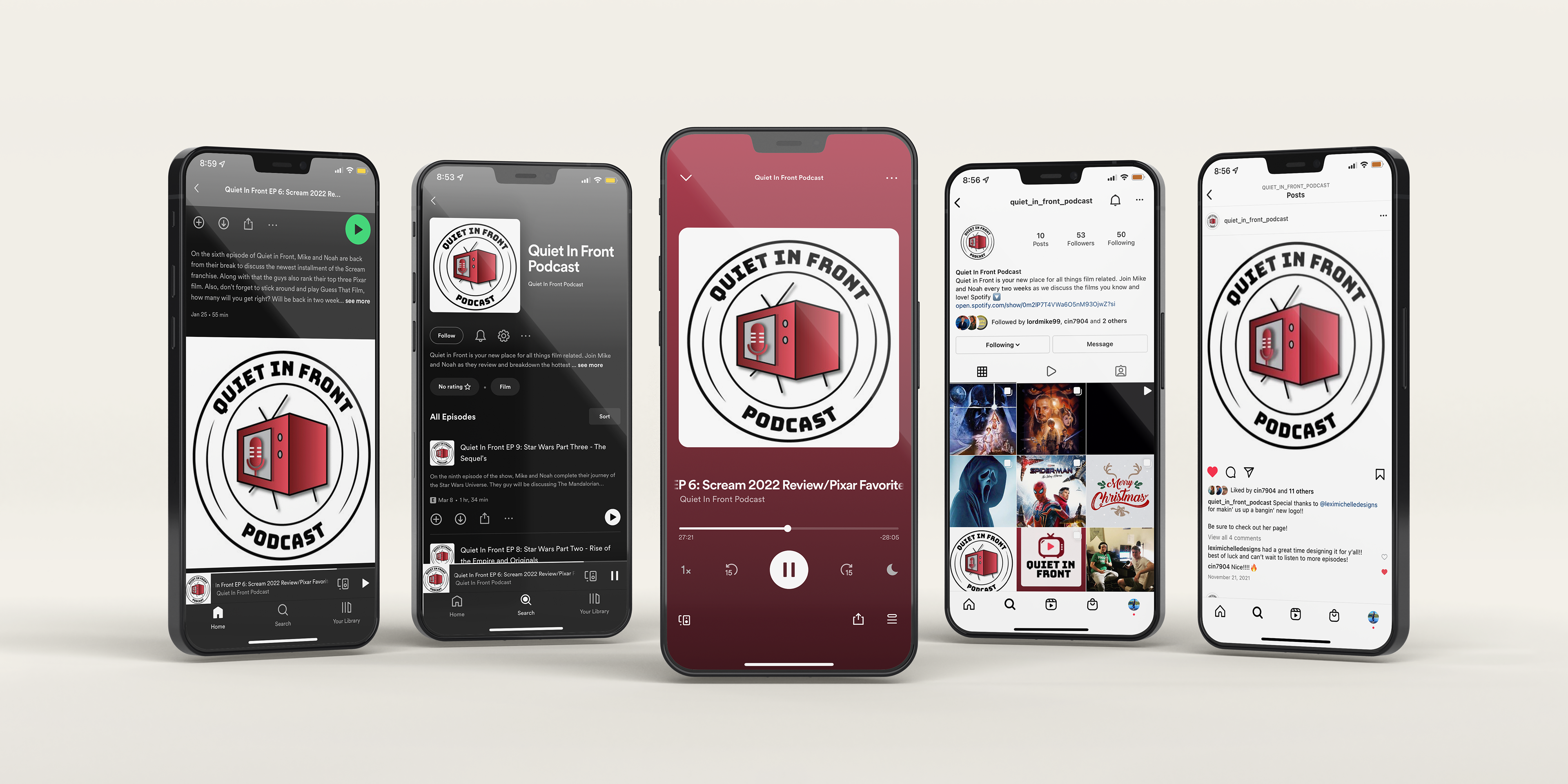
Logo In Use
Below shows some mockups of the new logo in use through Spotify or Instagram.