About the Project
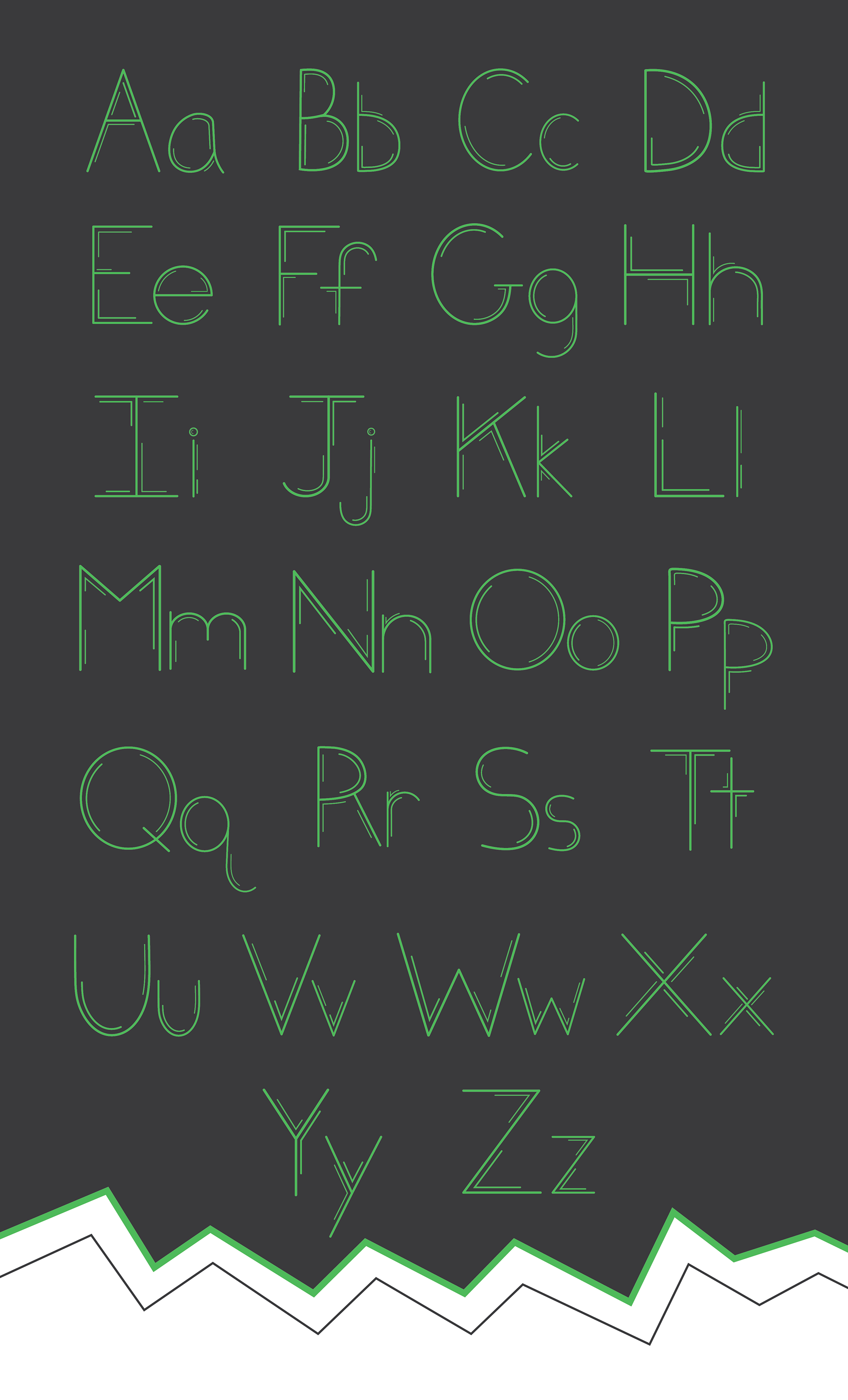
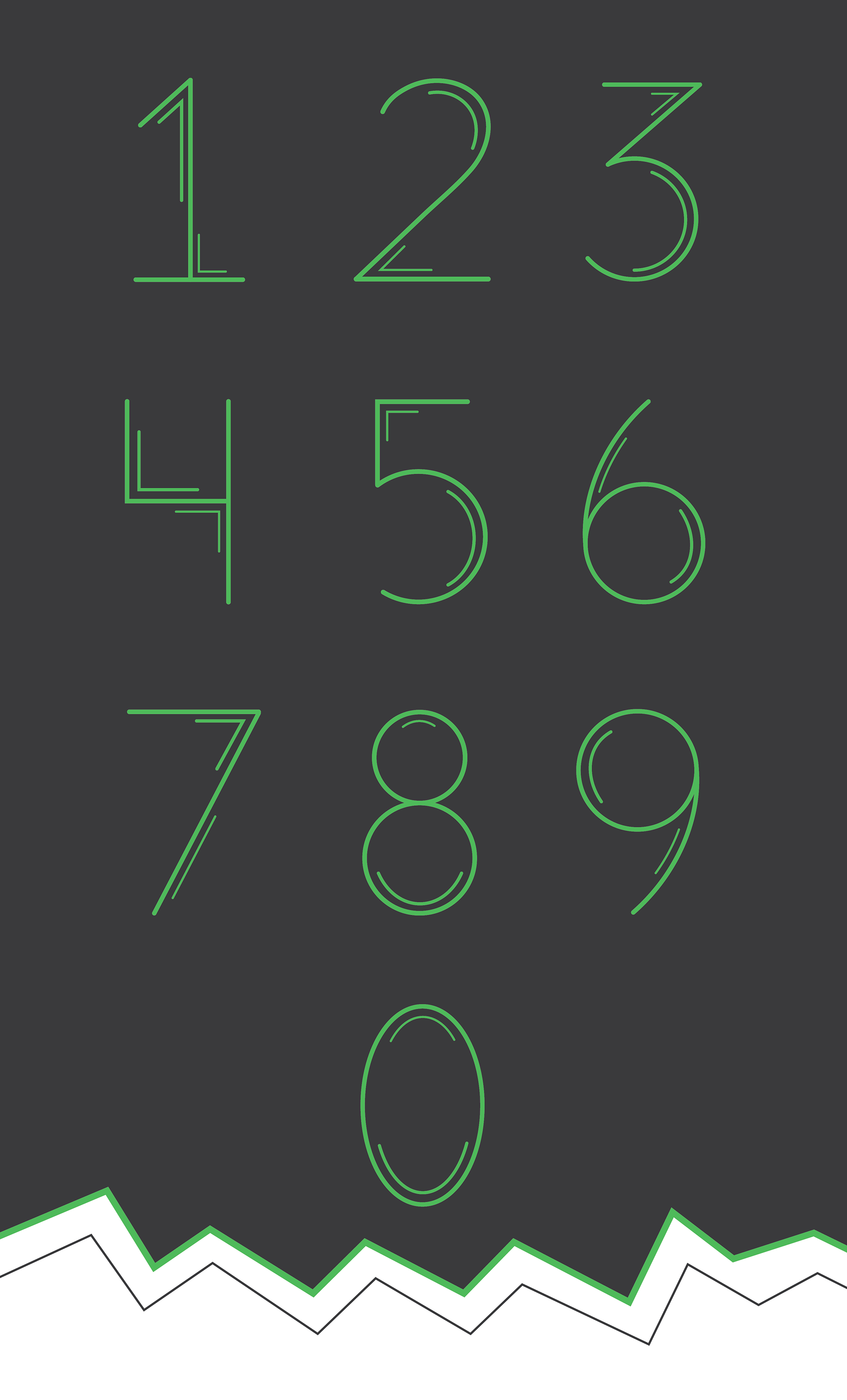
The goal of this project was to create a typeface of our own using Adobe Illustrator. I've always enjoyed designs that have linear elements to them. I knew I wanted to create a display font as it would be the kind of font to be able to see all of the detail that would go into the typeface.
Thought Process
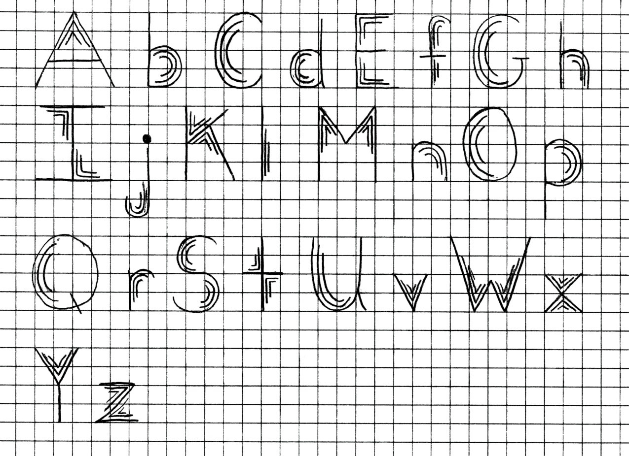
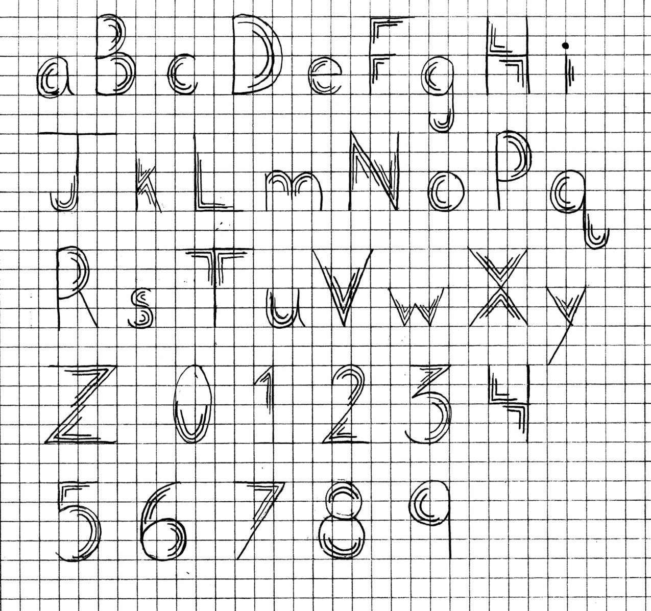
I knew I wanted to have some kind of linework within my font. I was immediately thinking of a display font that gave off the illusion of pulsing/vibrating. I started out with sketches to get more of an idea of what I wanted to do. I sketched out both the uppercase and lowercase versions of the alphabet in my font and also the numbers 0-9. Once I was happy with the sketches, I would move on to Adobe Illustrator to start digitalizing my font and bringing it to life.
Adobe Illustrator
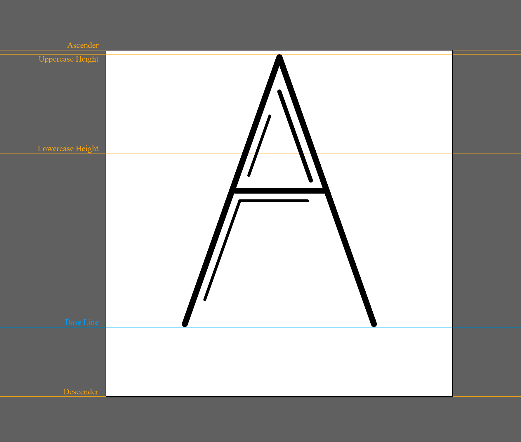
This is a screenshot of the guides I used when creating my entire font in Adobe Illustrator. I wanted to have two different line weights for the accent details to add a bit of variation.
Mockups
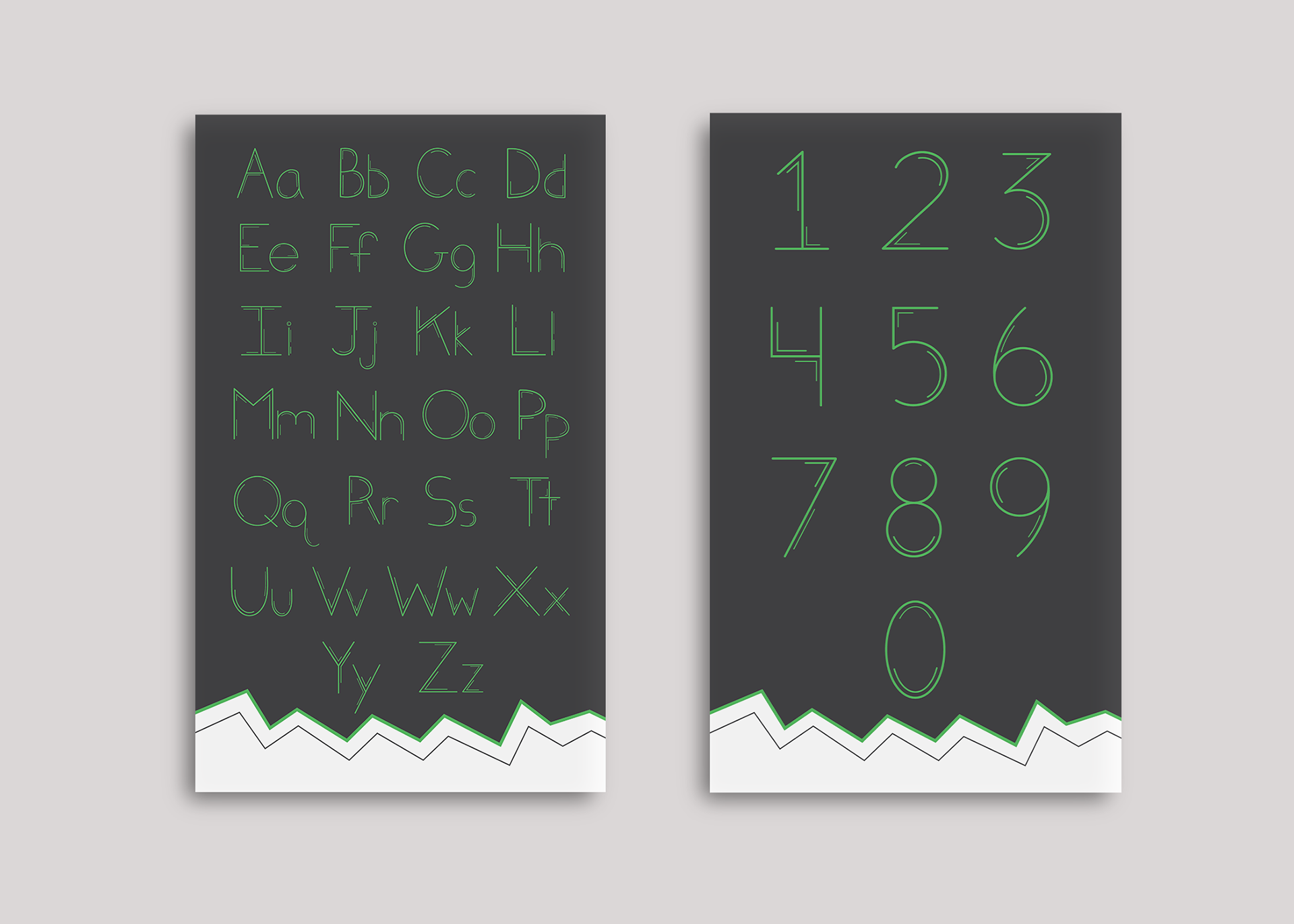
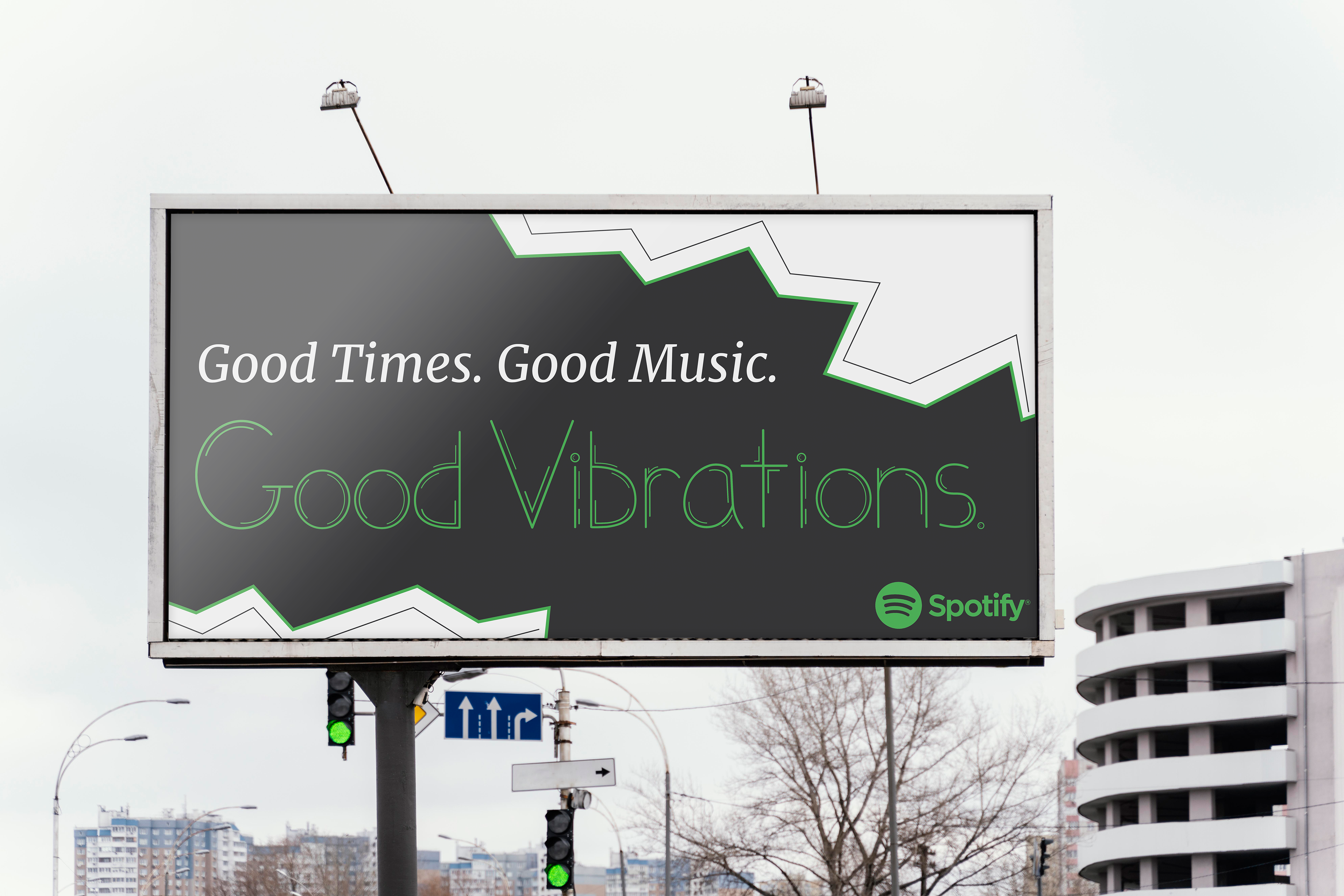
Below are some mockups of the type specimen for the uppercase and lowercase versions of the alphabet. Also included are the numbers 0-9 and a poster of the name of the font, Good Vibrations. I decided on the name Good Vibrations as it felt appropriate with the design of the font as well as having a friendly name to make people want to check it out more/see what it's about.