About the Project
The goal of this project was to create a 404 Error Page of our choosing. The main objective of this project was to include an animated element using HTML/CSS to create more depth in not only the coding but the overall appearance of the page. This would help bring more excitement to the user rather than frustration that normally results in an error page.
Thought Process
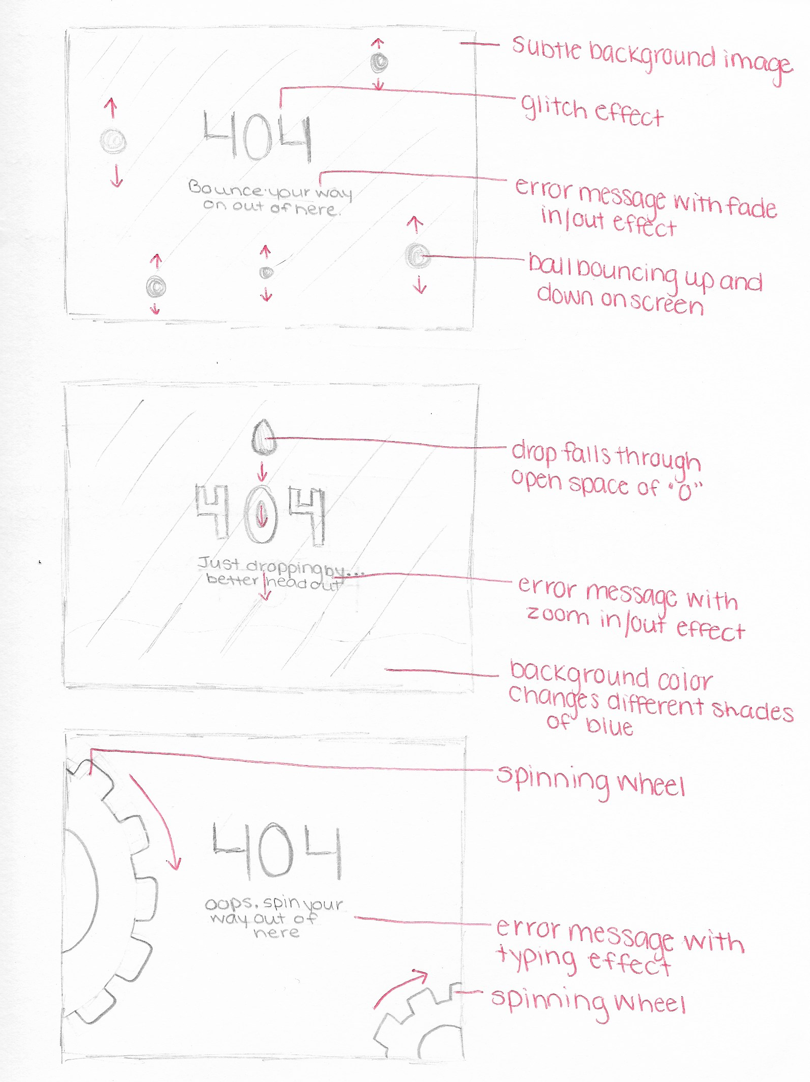
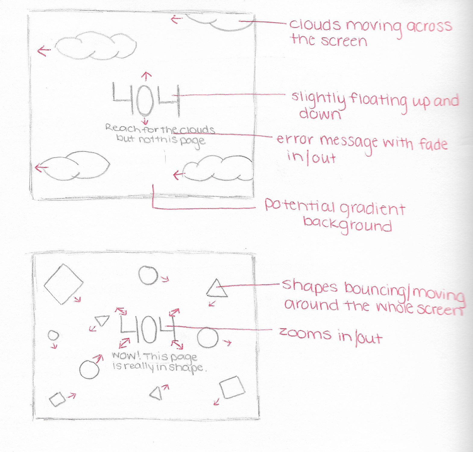
I began by sketching out a few ideas of what I wanted to do for my error page and figuring out what animated elements I could add. I remembered that this all needed to be done with coding and people don't typically stay on a 404 Error Page long. I wanted the animation to be simple enough but also appear on the screen in a timely manner so the audience can see the full effect before exiting.
Adobe Illustrator
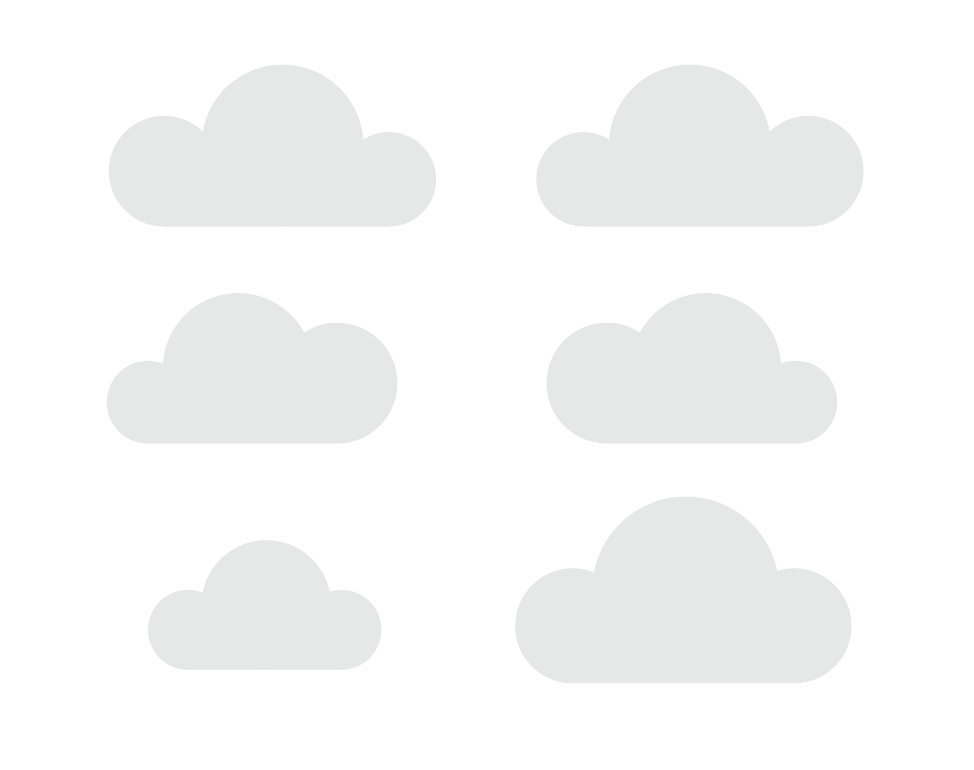
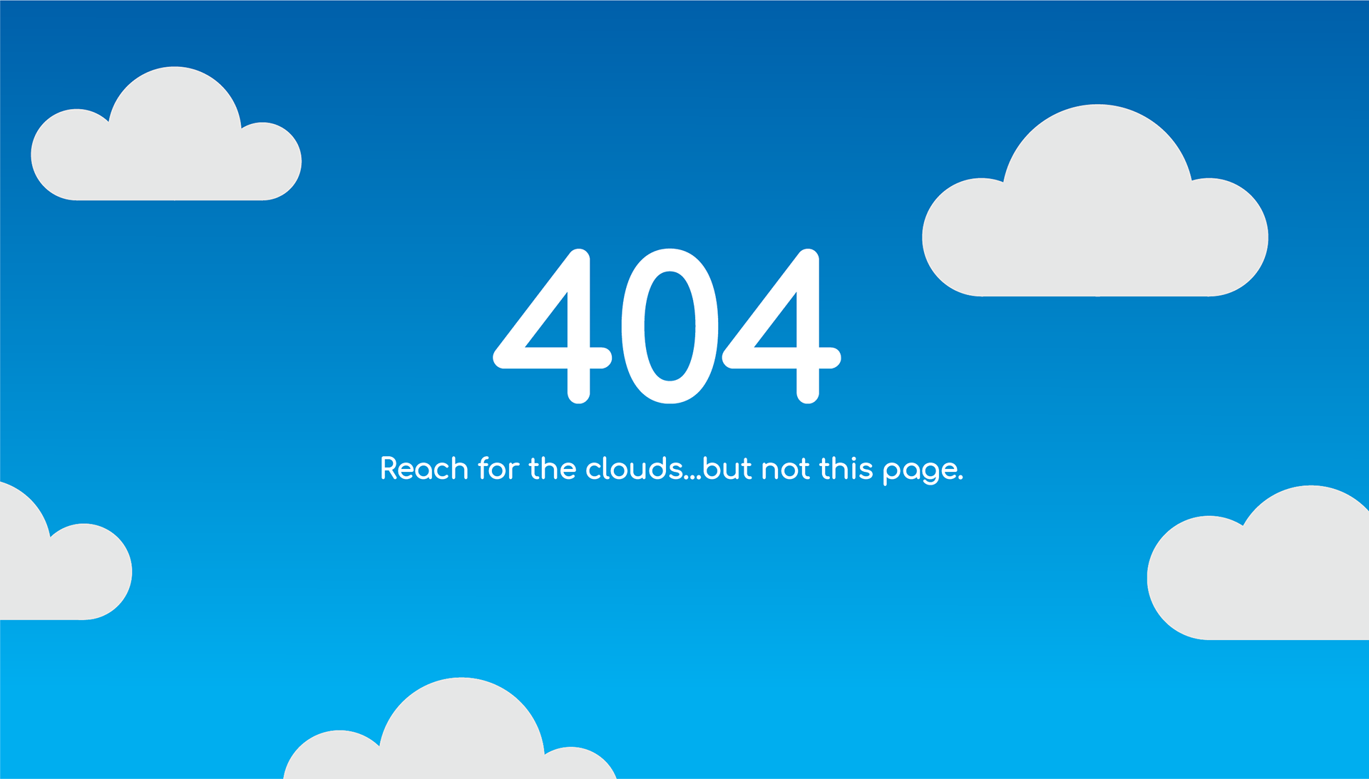
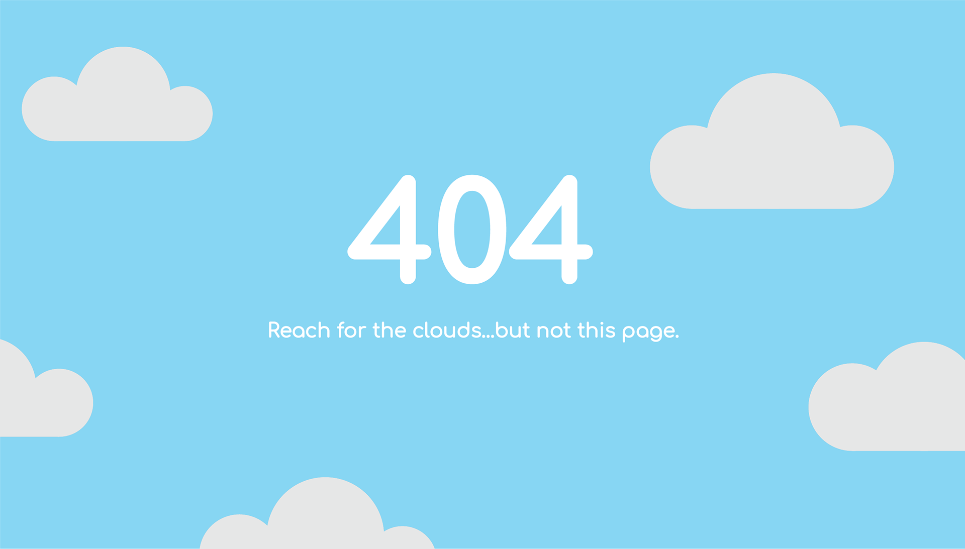
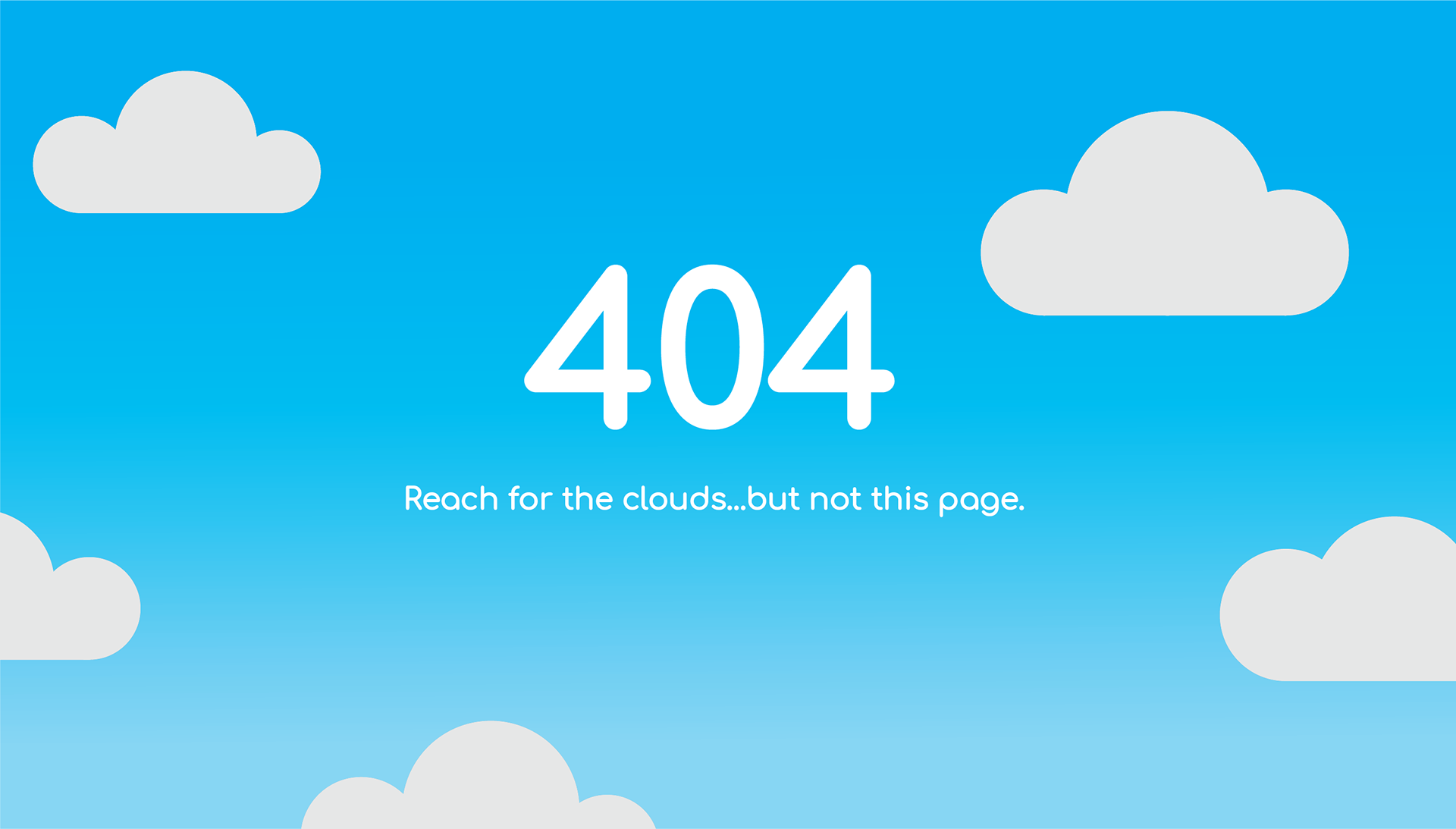
After deciding on wanting to focus on the sky and clouds theme for my error page, I began creating illustrations of the different clouds that I wanted to move across the screen. I also made a few mockups of potential gradient backgrounds with all the elements included to see which would work best.
HTML/CSS
I then moved on to the coding aspect of the project after I had a structure down for what I wanted to do with the entirety of the page. I used a software called Sublime to create my code for the 404 Error Page. To the left is a little snippet of my code that went into creating the finished product.
Video
Below is a video mockup of the 404 Error Page in full effect. I wanted the clouds to vary in size and disperse at different times to make it all feel more realistic. There is a subtle gradient for the background to create some depth to it. I went with a more playful font to help make things seem more friendly and allow the audience to feel more relaxed than serious/stressed.
